Create Consistent and Stunning Color Palettes
Learn to create consistent color palettes for UI/UX design. Explore brand, neutral, and semantic color categories. Compare HSL and OKLCH methods for shades, ensuring accessibility, optimal contrast, and usability across modes. Achieve a cohesive, user-friendly interface with these key insights.

Colors and their shades play a fundamental role in UX/UI design, helping to convey mood and brand identity as well as aiding in navigation. In this article, I want to explore how to create consistent color palettes – a task that is more challenging than it might initially seem.
Understanding the Categories of Colors in a Design System
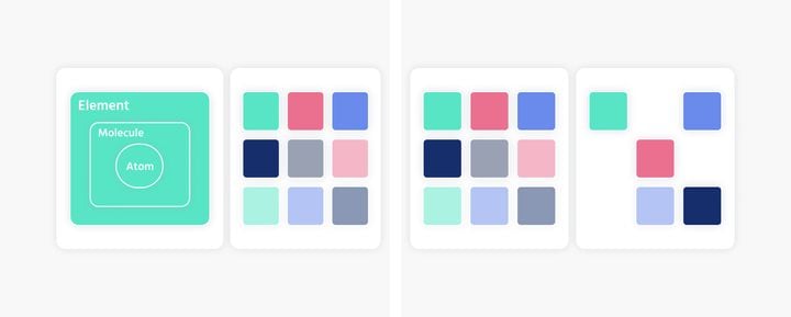
Colors are an integral part of a design system, typically categorized into at least three groups:
Brand Colors
A brand color is a specific color a company uses to represent its visual identity and create recognition. Brand colors can also be divided into primary, secondary, tertiary colors, etc.
Neutral Colors (Gray Tones)
Neutral colors in UX/UI design create a balanced and pleasant environment that highlights important elements without distraction. Shades of gray can be used to create depth and hierarchy.
Semantic Colors
Semantic colors specify meanings and functions. They should be used consistently to inform users about status, actions, or states, such as red for errors, green for success, or blue for information.
The Importance of Color Shades and Gradients in a Design System
Gradations or shades of colors in a design system are crucial for ensuring flexibility and consistency in design. They allow for the representation of various visual hierarchies and states, such as hover effects and dimension/depth through different background colors. This helps maintain a cohesive appearance, enhances usability, and ensures that the design functions well across different contexts and devices.
Examples and Best Practices:
- Hover Effects:
Use slightly lighter or darker shades of a button’s base color to indicate hover states, providing a visual cue that the element is interactive. - Depth and Dimension:
Implement different shades of background colors to create a sense of depth and hierarchy. For example, a lighter background shade can be used for cards or panels that sit on top of a darker base layer. - Accessibility:
Ensure that there is sufficient contrast between different shades to meet accessibility guidelines. This is particularly important for text readability and for users with visual impairments. - Consistency Across Devices:
Test your color shades on various devices and screens to ensure they appear consistent. Different screens can render colors differently, so it’s essential to check for consistency in various environments. - Emotional Impact:
Consider the psychological effects of different shades. Lighter shades can evoke a sense of calm and cleanliness, while darker shades can create a sense of sophistication and authority.
By thoughtfully applying color shades and gradients, you can create a more dynamic and user-friendly interface that enhances the overall user experience while maintaining a consistent and professional look.
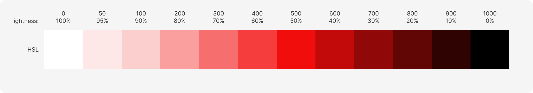
Creating Color Shades from a Base Red Tone
Using HSL
Starting with a shade of red (#F20D0D), I want to create shades in 10 (+2, black and white) gradations. To differentiate them, I use a numbering system inspired by stroke weights in typography.
The color #F20D0D in HSL is represented as follows: hsl(0, 90%, 50%). The lightness is at 50%. From here, I will approach white and black by adjusting the lightness.
Process:
- Define the Base Color:
Begin with the base red color, #F20D0D, which in HSL is hsl(0, 90%, 50%). - Create Gradations:
Adjust the lightness in increments to create 10 shades. For example, increase the lightness by 10% for lighter shades and decrease it by 10% for darker shades.
Additionally, include pure black (#000000) and pure white (#FFFFFF) to complete the 12-step scale. - Numbering System:
Use a numbering system similar to typography stroke weights to label each shade. For instance, the base color can be 500, with lighter shades as 100, 200, etc., and darker shades as 600, 700, etc.
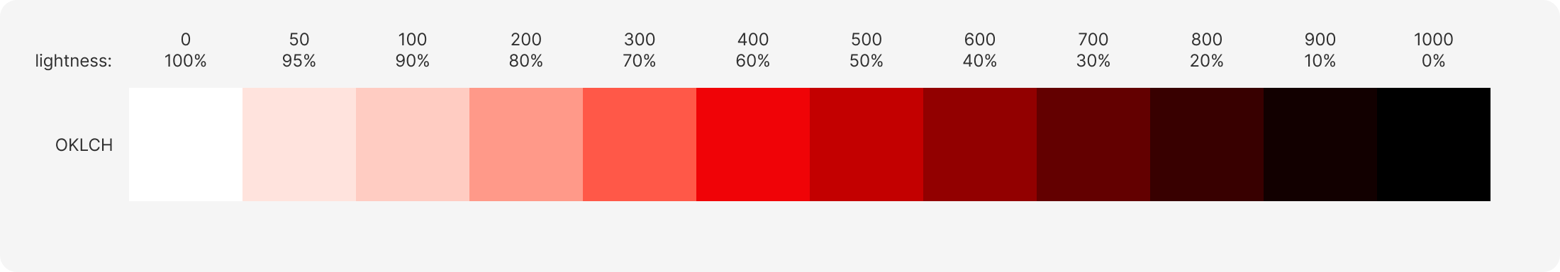
Using OKLCH
The color #F20D0D in OKLCH is represented as follows: oklch(60.64%, 0.245, 28.87). The lightness is at 60%, indicating that the same color is interpreted as about 10% lighter in the OKLCH color space compared to HSL. From here, I will approach white and black by adjusting the lightness, similar to before.
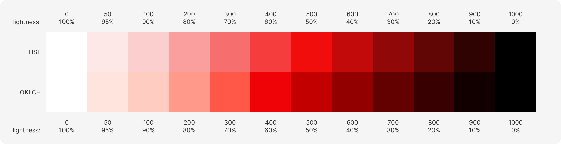
Comparing HSL and OKLCH
When comparing the two color palettes side by side, two key differences are noticeable, right away:
- In the HSL color space, lighter shades of the base color can shift away from the original hue. For example, red hues may veer towards pink.
- HSL and OKLCH interpret the same or similar color values with varying levels of lightness.
Evaluating and Optimizing Color Palettes for Accessibility and Usability
Creating a functional color palette is a complex task that would vary depending on the specific product. However, some fundamental principles remain constant, such as adhering to accessibility guidelines for contrast ratios. To ensure these guidelines are met, I will first measure the contrast of color palettes created with HSL and OKLCH against white. As expected, the results confirm that OKLCH generally renders colors darker compared to HSL.
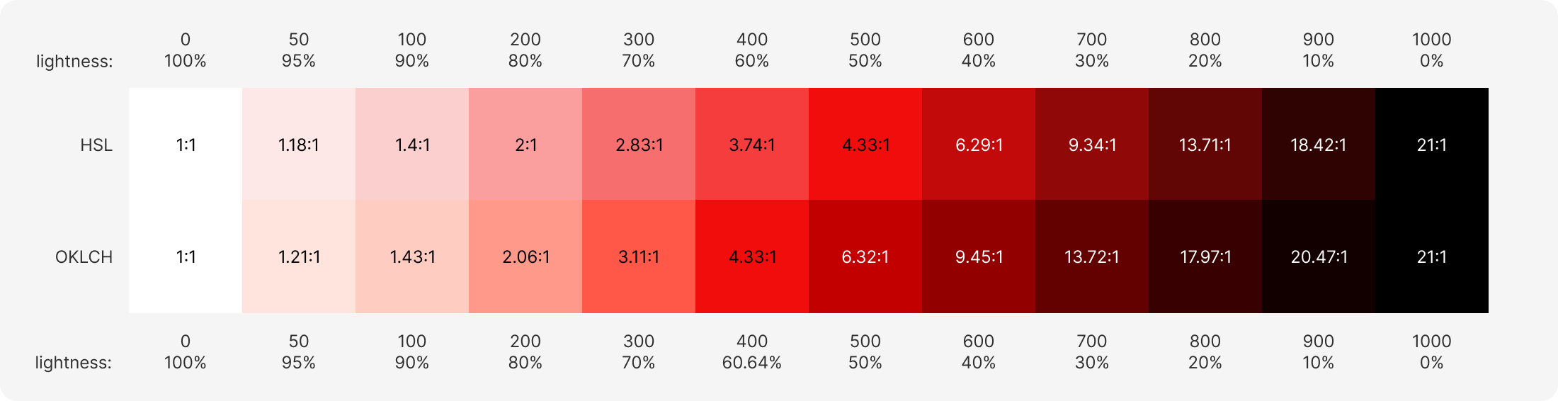
For a truly effective color palette, it's essential to ensure that contrast ratios comply with WCAG (Web Content Accessibility Guidelines) standards. Moreover, the gradations in the palette should not be purely linear. Light mode typically requires a range of lighter shades, while dark mode needs a range of darker shades. In this instance, I have focused on optimizing the palette for light mode.
It might also be important to verify that contrast ratios are adequate not just against white but also relative to other colors in the palette to maintain overall accessibility.
Given my preference for the color accuracy provided by the OKLCH standard over HSL, I use Evil Martian’s OKLCH Color Picker & Converter and Stark’s Contrast & Accessibility Checker in Figma. This allows me to ensure that the contrast ratios I aim for are consistently achieved across different tools. If you want to learn more about the pros of OKLCH, check out this blog post.
Here is the result:
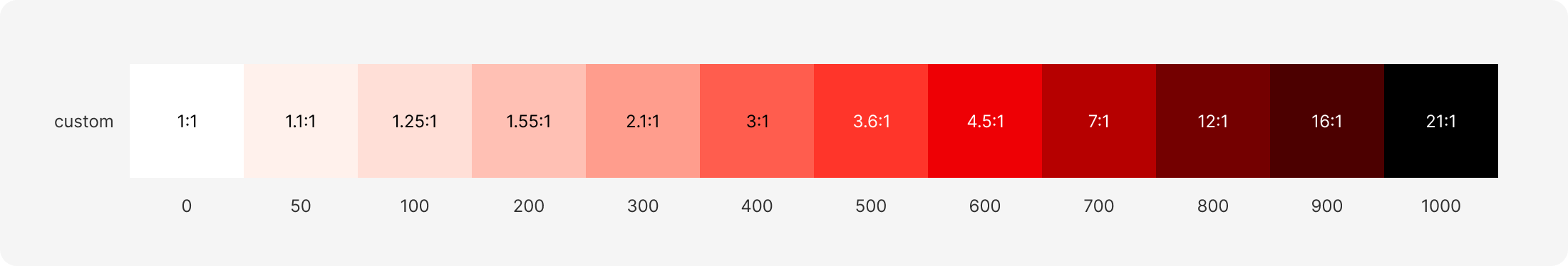
Final Evaluation and Comparison of Color Palettes
Overall, I am quite satisfied with the result. Depending on the project, I could consider making the shade 400 a bit darker to ensure it provides sufficient contrast with shade 50. In general, it's important to test whether the color palette works within the layout and not hesitate to adjust it if needed. In cases where brand colors are prescribed, efforts should be made to integrate them into the palette rather than altering them.
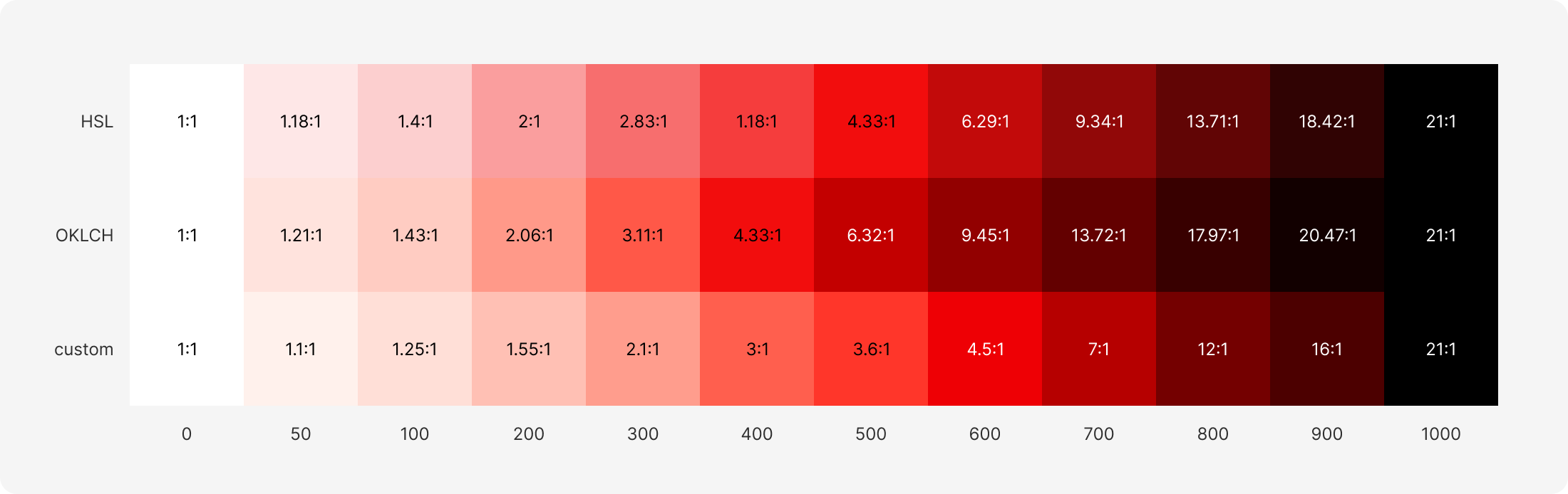
In conclusion, here is a comparison of all three color palettes:
Do you need help with your design project? Don't hesitate to contact us here!