RGB, HSL and the waiting for OKLCH
Our eyes perceive colors through cones, which are sensitive to different wavelengths of light. While the exact number of colors is not well-defined, it is generally believed to be in the millions. Since colors are everywhere, we all have an intuitive understanding of how colors work. However, it turns out to be very hard to represent colors in an intuitive way digitally. I do not mean the actual color you see on screen (screen color calibration is to be considered, but not todays topic) but the encryption of a particular color. As Designers we work with colors a lot and we notice the little problems that can appear when using the most common color representation systems. OKLCH is a system that has none of these problems, but unfortunately has not yet been implemented in our main development tool Figma.
While waiting for that to happen, I want to give you an overview over the RGB and HSL color representation models and their problems for designers before explaining the OKLCH representation and why it is worth using. But first, let's look at two common color representations for screen design:
RGB: Good for controlling pixels
Red, green and blue are the primary colors of light. The RGB color model refers to each of them and is probably the most common and widely-used color representation for all kinds of electronic displays.
In the RGB model, each color is represented by a combination of red, green, and blue light. The intensity of each color can be varied from 0 (no light) to 255 (maximum intensity). This means that there are 256 possible levels of each color, resulting in over 16 million possible color combinations.
Now a problem with this partucular way of representing colors is that its hard for humans to guess which color you are looking at from just the code. Furthermore it's not easily possible to create shades from a certain color without a lot of tweaking or the use of external tools.
Like, guess this color:
rgb(203, 195, 227)It's a nice light purple
#CBC3E3Same purple in HEX
HSL: Great for choosing colors
The next type of color representation already takes human readability into account; lets have a look at HSL (there are similar approaches like HSB or HCL but HSL it probably the most common):
HSL stands for "hue", "saturation" and "lightness" which bahve as following:
- Hue: This value indicates which color is represented in degrees on the color wheel. The color wheel consists of 360 degrees, with red at 0 degrees, green at 120 degrees, and blue at 240 degrees.
- Saturation: This value indicates how "pure" the color is. A color with a saturation of 0% would be gray, while a color with a saturation of 100% would be fully saturated.
- Lightness: This value indicates how light or dark the color is. A color with a lightness of 0% would be black, while a color with a lightness of 100% would be white.
Lets check out our Purple in HSL:
hsl(255, 36%, 83%);While the H-value remains to be harder to read we can easily say from the S-value its a less-saturated color. From the L value we can tell it's got to be bright. So I would assume this color to be some kind of pastel-ish.
This is very nice to read if I know what spectrum the H value refers to. So why am I not always happy with using this color representation in Projects?
Reason 1: Relative Saturation not consistent.
When I create shades of my Purple I do not get a consistent relative saturation. Meaning; the lighter colours usually look less saturated compared to darker colors.


Reason 2: Color not true to tone.
The actual color (hue) might change tint in different lightness levels. To demonstrate the effect let's increase the saturation to 80 – this usually makes it more visible.

Reason 3: Relative lightness is not considered
This issue might not be a big deal if you stay within your shades of a single colour but if we introduce a second color we might need to do some adjustment. This can be done easily but if you maintain a product that includes colour themes it can get really cumbersome to guarantee accessibility.

Why are we looking forward to OKLCH?
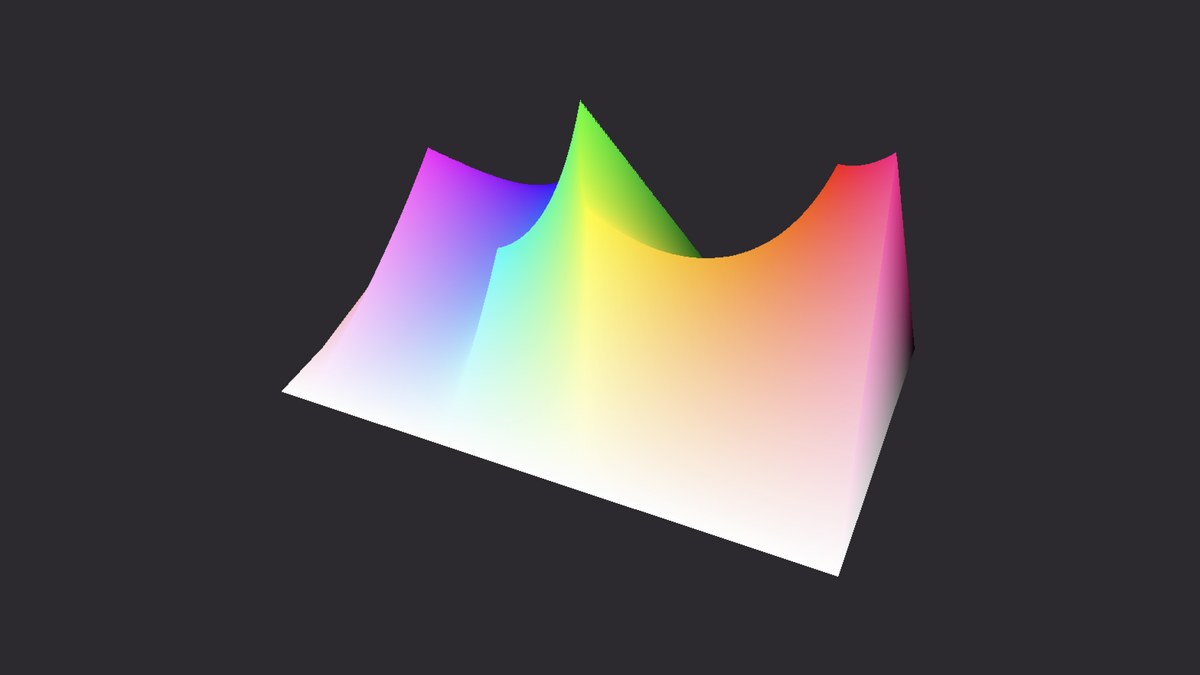
The OKLCH color space was designed to be more perceptually uniform than other color spaces, meaning that differences in color values correspond more closely to differences in human perception of color. This makes it useful for a variety of applications, such as digital image processing, color management, and color visualization. It takes into account the issues with RGB and HSL mentioned above:
- human-readable color representation
- consistent saturation amongst shades
- color true to tone
- relative lightness is considered
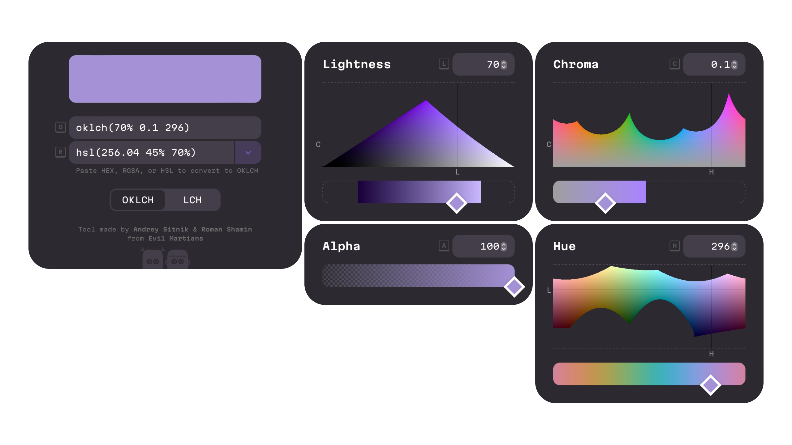
The letters in (OK)LCH stand for the four components used to describe a color in this color space: L (lightness), C (chroma), H (hue). Lightness is the perceived brightness of the color, chroma is the perceived intensity of the color, and hue is the perceived color itself. Like RGB and HSL OKLCH also supports an alpha value which indicates the transparency of the color.
The OKLCH model is based on the LCH color representation model but the coordinates used in OKLCH are closer to human perception than the coordinates used in LCH. This means that differences in chroma and hue values are more visually accurate and consistent with what our eyes see in OKLCH. Additionally, OKLCH provides a more intuitive and natural representation of color than LCH, making it easier for designers and artists to work with.
Overall, OKLCH is a more advanced and perceptually uniform color space compared to LCH, and it is increasingly used in applications such as color grading, image processing, and color management. So the OK in OKLCH can be understood as it's fine to work with me.
Can I use OKLCH?
Most modern browsers already support OKLCH so feel free experimenting with it or learn more from Evil Martians. As a designer I still wait for Figma to implement it and since our developers usually work within the React Native Framework we also rely on that to support OKLCH in order have the full potential. This leaves us with good old HSL and a little bit of extra effort to make our design systems nice and consistent.
If you want to know more about how you can make your digital products more accessible feel free to contact us here.
Interested in more information about UI/UX Design? Then check out this blog article about accessibility in UI/UX Design or this post about planet centric design.