Best Practice: Accessibility in UX/UI Design helps everyone

Accessibility means usability for users who interact with products and services differently. This covers blind, colour-blind or visually impaired people, deaf people or people with hearing problems, people with temporary or permanent mobility impairments or people with cognitive disabilities. A designer's job is to consider accessibility as part of the user experience to ensure that everyone, regardless of their limitations, can use the product or service. To be upfront, taking this aspect into account is not an obstacle to innovation but ultimately leads to better designs and a higher quality experience. Which at the same time doesn't force you to make an ugly, boring or cluttered product.
" People ignore design that ignores people." — Frank Chimero
But looking at the current state of affairs, it is already clear that accessible experiences are becoming more and more the norm and it is great to see that designers care about the 19 % of users who have some form of disability. At the same time, this aspect contributes to achieving the social goal of inclusive coexistence.
Planning for accessibility
Regrettably, the design generally places more emphasis on aesthetics than on accessibility. But with the right planning and design for all users, we can advance accessibility.
In some instances, designers may feel that designing accessible experiences is a limitation. So let's try not to think of accessibility as having design constraints, but rather as creating a more inclusive experience that benefits all users. One of the most important steps is not only to create awareness for oneself, but to try to bring the whole team along and show the importance. A corporate culture that is designed not to remain in routines but to initiate change can be an additional help.
As there are different levels of accessibility, you should consider which points you want to include before you start planning, as it can be difficult to adapt or add certain features afterwards. Furthermore, you should think in advance about how to test these aspects during the prototype phase. For some topics like contrast or colourblindness you can find useful plugins or programmes, but when it comes to testing focus orders or similar, it will be better to test with the people it affects. Here are some initial questions you can ask yourself before starting to plan:
- What contrast ratio must be achieved between text and background?
- How can the text be enlarged without destroying the layout?
- Can I offer users a range of presentation options?
- How do focus states behave?
- What does a design look like that is not relying solely on colours?
- How does the content get a logical structure and hierarchy?
- How can the consistency of menus, icons and buttons be ensured?
- Can I access everything with just the keyboard?
- Can subtitles be provided for videos?
- Do users have access to audio descriptions for video content?
- Are the animations accessible?
Useful design guidelines
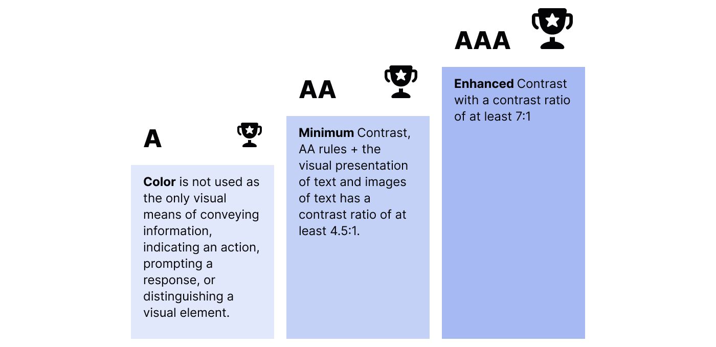
The World Wide Web Consortium (W3C) sets standards for accessible design in its latest Web Content Accessibility Guidelines 2.1 (WCAG). They are divided into the three levels A, AA and AAA, whereby the middle level can already be seen as the minimum that should be implemented. Below you will find a list of important aspects. In addition, it is advisable to get your own impression on the Consortium's website.
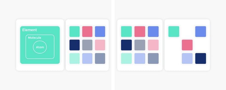
- Colour: Remember that colour is not the only visual means of conveying information. This helps users who are unable or have difficulty distinguishing one colour from another.
- Contrast: Pay attention to a sufficient contrast between text and background. The plugin Stark, for instance, which is available for several design programmes, can help you to check this. The visual representation of the text has a contrast ratio of at least 4.5:1, except for large format text which has a minimum of 3:1.
- Typography: The font must be large enough and symbols need to be distinguishable. Ensure that text can be resized up to 200 % without losing content or functionality.
- Focus State: First of all, you should make sure that there is a focus style. Everyone knows the blue border around a form field. This can be styled differently, but it is important that it is still visible and noticeable.
- Form: In recent years, many modern designs have eschewed traditional identifiers and interactive capabilities in favour of a minimalist approach. On the one hand, a form must be designed as simply as possible, but on the other hand, visible elements that would affect legibility must not be omitted.
- Content: Simple language as defined by the UN Convention on the Rights of Persons with Disabilities aims to enable people with reading difficulties to participate in society. It follows certain rules and can thus reach more users. The visual appearance of images and texts must be clear.
- Keyboard/Voice control: By default, all actions that a user needs to perform should be able to be performed with a keyboard or voice.
- Hover: Try not to hide interactions under hover effects. This principle prevents people who only use a keyboard or use speech recognition programmes from interacting properly with our product.
- Video: For people who rely on reading, subtitles are necessary so that they can fully experience the video. It is also desirable that the user has control over the playback of the video, i.e. that the playback does not start automatically. As videos are a very wide field, there are also other possibilities such as transcriptions, etc.
- Animation: Animations can indeed enhance the experience and accessibility, as well as clarify successful or failed actions, for example. However, great care should be taken in the design, as strong animations can make people feel dizzy, disoriented or cause other reactions.
- Focus Order: Providing sequential navigation with focusable components where the order preserves meaning and usability.
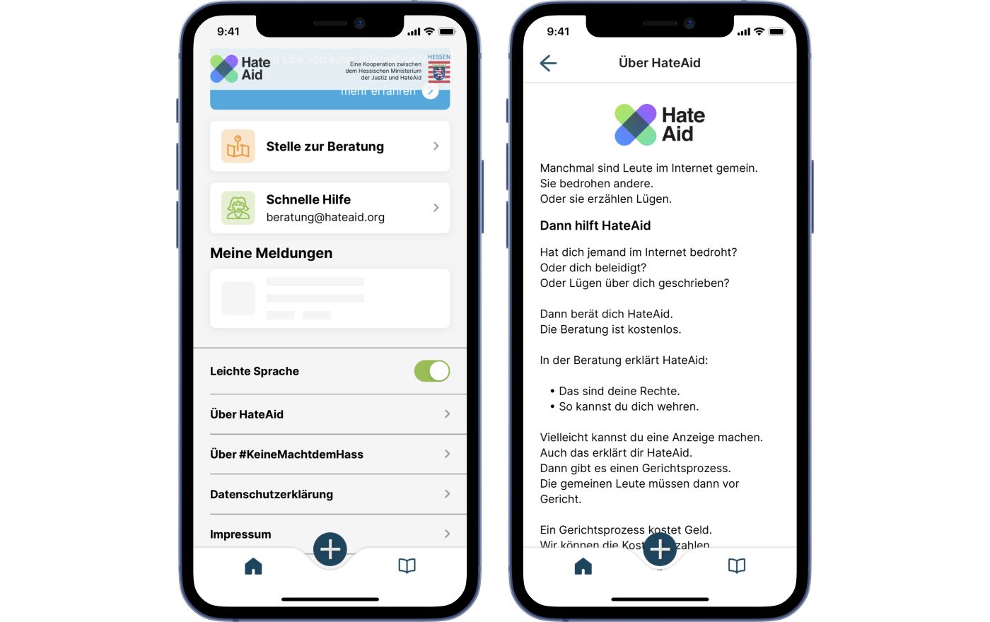
App MeldeHelden that we designed and developed for HateAid uses simple language as language option.
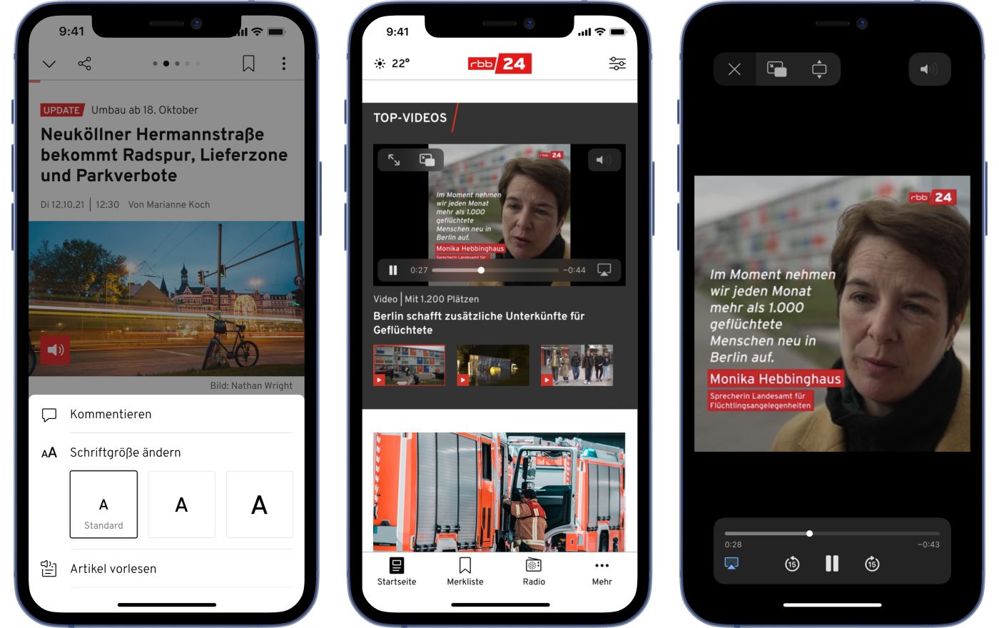
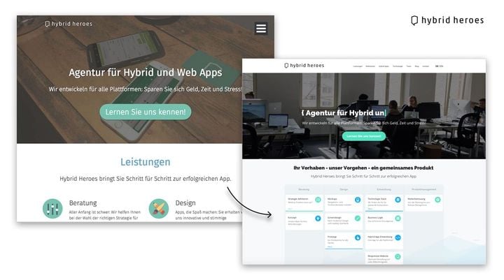
App rbb24 that we designed and developed for Rundfunk Berlin-Brandenburg uses several in-app accessability features.
Benefits for all users
It stands to reason that accessibility features that help people with disabilities often help other people as well. So not only is everyone happy about better readability, but the right contrasts and colours can also counteract the symptom of eye fatigue or, for example, improve legibility under bright sunlight. Furthermore, video captions can not only help people with hearing difficulties but also everyone else has the possibility to watch the video on mute. Another example is content that cannot be barrier-free due to its complexity, which is not directly related to a disability, but must be taken into account due to the different ability levels of society.
Even though the EU is already thinking about effective measures to implement accessibility, it is important not to start at the point of imposing penalties, but to seize the moment, as designers have a fundamental social responsibility.
If you want to know more about how you can make your digital products more accessible feel free to contact us here.
Interested in more information about UI/UX Design? Then check out this blog article about planet centric design. Or check out this post about rgb vs oklch vs hsl.