Test, manage & document components with Storybook JS
Storybook can be used for a variety of cases. In this introduction to the basic functionalities we show how designers, developers and project managers can benefit from the open source software.
As the complexity of an app or web application increases, so does the need for documentation. Probably every developer, UX/UI designer or project manager has been in a situation where they have lost track of the existing components. Questions like "What was the primary color again?" or "Do we already have a component for this?" are not uncommon. Meanwhile, there are tools that can help improve the process and bring some light into the darkness. For Hybrid Heroes, we decided to use Storybook in some of our products.
What is Storybook? And when do we use it?
Storybook is an open source tool for building UI components and pages in isolation. It streamlines UI development, testing, and documentation. – Storybook
For many projects, Storybook is an essential tool when it comes to creating a design system. A design system provides the basis for a good user experience and a consistent, appealing and scalable design. We have already published an article on this topic, where you can read more about it and how we use it. In practice, the Atomic Design approach produces a large number of components that make up a later application. Storybook provides an ideal platform to manage them.
This is exactly why we use it when a customer needs a comprehensive design system for their application. In addition to the components, it can also be used to document colors, fonts and important information.
How does it work?
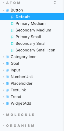
Storybook can be added to most common frontend projects. Stories are created for the components, which contain the essential parameters and properties necessary to display the desired component and its variants in the Storybook UI. The technical implementation will be explained in more detail later. The components can be divided into groups. If you follow the atomic design approach, those groups are: atoms, molecules and organisms. But you could also use any other structure that best suits your use case. The allocated components are visible in the sidebar. In addition, the individual variants of a component can also be accessed from there.
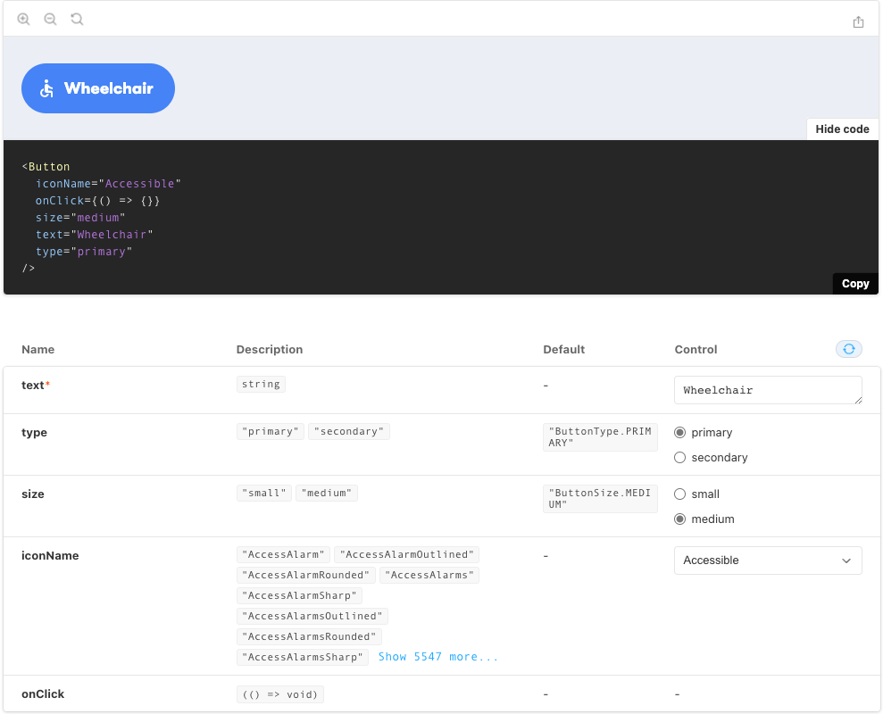
For each component there is a canvas, a kind of playground, and a documentation page, on which all variants and the relevant information are located. Storybook offers the advantage that it can use the interfaces defined in the source code and make them usable as controls without further configuration.
export enum ButtonType {
  PRIMARY = 'primary',
  SECONDARY = 'secondary',
}

export enum ButtonSize {
  SMALL = 'small',
  MEDIUM = 'medium',
}

export interface ButtonProps {
  type?: ButtonType;
  size?: ButtonSize;
  text: string;
  iconName?: IconType;
  onClick?: () => void;
}
Button Properties
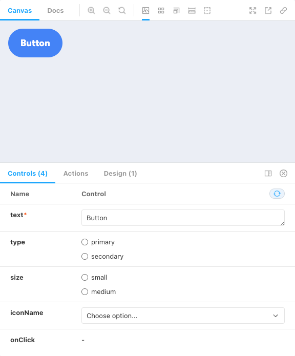
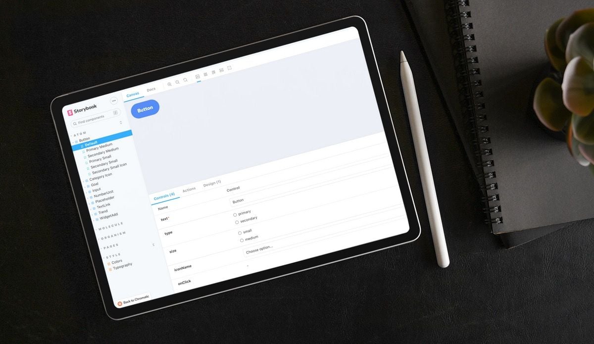
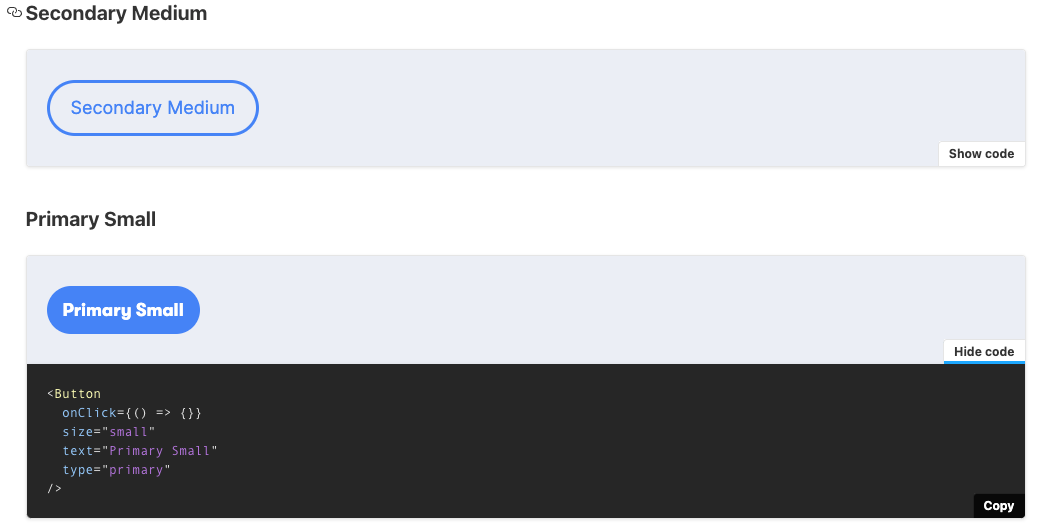
Storybook canvas - example
The documentation page offers an interactive overview of all parameters and the collection of defined variants, as well as the possibility to copy the source code of the components.
What advantages it offers us
Storybook offers many advantages not only for the developers, but also for the project managers, the UX/UI designers and the customer.
For project managers
Storybook makes it easier for project managers to get an overview of the existing and already implemented components. It also enables an isolated quality test, which can also be automated with additional tools. More about this later. In addition to testing, Storybook also serves as documentation for the application-relevant content. The basis for the writing of documentation is MDX, which is an extension of the well-known Markdown format.
As a UX/UI designer
To ensure that the original design and the actual implementation are not completely different from each other, Storybook's Figma integration allows the design to be shown directly next to the implementation, making it easier to compare the two. Soon, however, it should also work in the other direction. The Storybook team is working on a Figma plugin that will allow the matching story for a component to be displayed directly in Figma. This will further simplify the handover process and the exchange between all stakeholders.
 Dominic Nguyen
As a developer
Storybook offers multiple advantages for developers. Besides the already described and the fact that it is a single source of truth, it massively improves the development workflow of components. The possibility to develop them in an isolated environment with the option to control all properties in the UI allows to develop faster more mature components. Tools like measuring and a changeable background makes it even more comfortable.
But not only the development of the components is improved, also the usage of them is easier. Every developer knows how important a good documentation is. That is not only the case for frameworks, packages or APIs but also for Component libraries. There are also several corporates who use Storybook as their component library. For example the React components for the IBM Carbon Design System.


It is even possible to directly copy the required component code with the adjusted properties, to the line you need it.
Technical Implementation
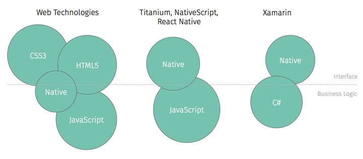
We use React as the basis for most projects, whether on the web together with Next.js or in app development with React Native. Storybook supports many other frameworks, but we won't go into them here. However, the basic structure of Storybook is always the same. After Storybook is successfully installed, you can get started right away.
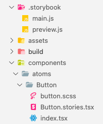
Storybook integrates itself into your preferred folder structure. The .storybook folder contains the necessary configuration files, which are required to configure addons or bundlers, for example. In addition, the preview can be customized, especially the possibility to add assets or define possible backgrounds for the canvas is helpful. Here you can also define in which folders stories should be searched for.
The Stories are the essential part of Storybook. Per component you define one story. These are following the structure of the Component Story Format, which is an open standard for component examples. This improves the usability even further with integrations for testing and other tools. The story file is allocated directly in the component folder, as you can see in the screenshot above. The code structure can be split into different pieces.
// Button.stories.tsx

//imports...

export default {
  title: 'Atom/Button',
  component: Button,
} as ComponentMeta<typeof Button>;
Button story initialization
In the code above can you see the initialization of Story. The title describes the group and name which is visible in the UI. The component is the actual imported Component, in our example a JSX Element. The properties of the component are in the UI visible as Controls. Storybook even uses the type informations when using TypeScript.
// Button.stories.tsx

const Template: ComponentStory<typeof Button> = (args) => (
  <Button {...args} />
);

export const SecondarySmallIcon = Template.bind({});
SecondarySmallIcon.args = {
  text: 'Secondary Small Icon',
  type: ButtonType.SECONDARY,
  size: ButtonSize.SMALL,
  iconName: 'AccessTimeRounded',
};
Button story template & usage
The Template is used to define multiple predefined variants, which will be visible in the Sidebar and the Docs tab as a variant.
Thats the basic technical implementation you can customize and extend that up to your requirements.
Chromatic - Storybook’s SaaS
Storybook has one more advantage, which is called Chromatic. It is a SaaS which is made by the Storybook maintainers and offers an automated workflow to test & deploy your instance. It comes with some awesome features like authentication or component history. Therefore it is directly connected with your repository on GitHub or GitLab and integrates well into existing CI/CD pipelines. It even enhances your testing with custom workflows and fully automated testing.
Use cases at Hybrid Heroes
You've read now a lot about the benefits and how it is possible to use Storybook, but what are the use cases we use it in? At this point it is also worth mentioning that it is not helpful in all cases. Especially in small projects or projects without many general components it is probably an overhead which is not worth the effort.
One example, which is the best possible use case, is a component library. We've used Storybook to create a classical React based component library which was grouped into atoms, molecules, organisms and even pages. We even extend the usage by adding documentation pages for color, typography and other utilities. The Component library was then bundled with Rollup so it could be used as any other component package. The components could then be used to build dashboards. The examples in this article were part of the project. The components were then used to create screens that have already been implemented in Storybook on a test basis. One of these can you see in the following video.
Storybook example screen
Another use case at Hybrid Heroes is not as common as the first one, it is a library for our own website. We wanted to have a transparent and comfortable workflow to develop modules, which could be used to build beautiful and appealing landingpages. This project is still Work in Progress, therefore we cant show something here yet. But we will definitely show more once the new Website is launched.
Also the usage of Storybook with React Native is something you can read in an upcoming blog post. So stay tuned!
If you are interested in getting your own app developed or need UI/UX Design for your app, feel free to contact us here.
Want to know more about UI/UX Design? Check out this blog post about Angular design or this blog post about the future of design tokens.