Getting started with Angular Material: Installation and first steps

Angular Material is a UI library that allows you to create apps using components based on Material, Google’s own design system.
One of the main selling points of this library is that it has been developed by the Angular team itself. It also includes a comprehensive list of components with theming options, so it’s a good alternative if you’re looking for consistency and easy customization.
Material has been around since 2014 and you have more than likely seen applications designed with this system, since it has not only been used consistently across most Google services but it has also been adopted by a number of companies on their applications.
Getting started
Let's start by creating a new Angular project with help of the CLI command ng new followed by the name of your project.
ng new angular-material-app
In order to install Angular Material go into your project and hit
npm install --save @angular/material @angular/cdk @angular/animations
This will install the necessary tools to create components from the library as well as the animations required to make those components work. After that you will need to import the BrowserAnimationsModule in your app.module.
import {BrowserAnimationsModule} from '@angular/platform-browser/animations';
And then add it to the imports array.
@NgModule({
  ...,
  imports: [
    ...,
    BrowserAnimationsModule
  ]
})
If you prefer to disable the library animations you can simply import NoopAnimationsModule instead of BrowserAnimationsModule. After that add it to the imports array the same way.
The library also makes use of HammerJs for some of the components gestures, which you you will need to install if you're going to use mat-slide-toggle, mat-slider or matTooltip. You can simply do it via NPM.
npm install --save hammerjs
Make sure you import 'hammerjs' on your app’s entry point (src/main.ts by default).
Material also has its own set of predesigned icons; you can check the full list here. If you are going to make use of those you can load them into your app the same way you do it with any other font. Go to your index.html and add the following line.
<link href="https://fonts.googleapis.com/icon?family=Material+Icons" rel="stylesheet">
Using Angular Material themes
Angular Material requires you to use a theme across your application. You can choose one out of the four pre-built ones or you can customize one yourself.
The ready-to-use themes are deeppurple-amber.css, indigo-pink.css, pink-bluegrey.css and purple-green.css. If you decide to go for one of them you can simply add it to your styles.css.
@import '~@angular/material/prebuilt-themes/name-of-the-theme.css';
If you prefer to customize your theme you can create your own theme file inside your project. We'll call this file 'custom-theme.scss'. Remember importing this file in your styles.css.
@import './custom-theme';
And add it to your angular-cli.json file inside the styles array.
  "styles": [
    "styles.css",
    "custom-theme.scss"
  ]
Inside the custom-theme.scss file you’ll need to import the Material theming and include the mat-core() mixin, which will generate Material’s core styles.
Afterwards you can define your own palettes with the help of mat-palette. This takes the colour name as a first argument, followed by its default, lighter and darker values as optional parameters in a range from 50 to 900. After that use angular-material-theme to create your theme. So your file should look something like this:
@import '~@angular/material/theming';
@include mat-core();
$app-primary: mat-palette($mat-deep-purple, 600);
$app-accent:  mat-palette($mat-lime);
$app-warn:    mat-palette($mat-amber, 400, 50, 800);
$custom-theme: mat-light-theme($app-primary, $app-accent, $app-warn);
@include angular-material-theme($custom-theme);
Here we are defining the app's primary, accent and warn colours using Material's colour reference. As mentioned above, the first argument of mat-palette is the colour name, and the following optional ones establish the default, darker and lighter variants. If no arguments are given the colour defaults to 500.
You can also check Material’s own guides to colour to find the colour names established by Material along with their swatches. On the example above we are using Material's given colours, but let's use our own custom colour as the primary one.
A useful tool to create your own palette is the Material Design Palette Generator. This platform will hand you all the colour references after choosing the default colour. In this case, we're using Hybrid Heroes' signature colour.
$hybrid-heroes-green: (
    50: #EAFCF8,
    100: #CBF7ED,
    200: #A8F1E1,
    300: #85EBD4,
    400: #6AE7CB,
    500: #50E3C2,
    600: #49E0BC,
    700: #40DCB4,
    800: #37D8AC,
    900: #27D09F,
    A100: #FFFFFF,
    A200: #DAFFF4,
    A400: #A7FFE4,
    A700: #8EFFDC,
    contrast: (
        50: $black-87-opacity,
        100: $black-87-opacity,
        200: $black-87-opacity,
        300: $black-87-opacity,
        400: $black-87-opacity,
        500: white,
        600: white,
        700: white,
        800: white,
        900: white,
        A100: $black-87-opacity,
        A200: $black-87-opacity,
        A400: $black-87-opacity,
        A700: white,
    )
);
After adding this to your custom-theme.scss file you can replace the $mat-deep-purple colour with $hybrid-heroes-green on $app-primary. You can optionally follow that with its darker and lighter variations as the next arguments, like we've seen above.
Making use of the components
Now that we're all set let's make use of some of the Angular Material components. The idea now is to make a simple UI for a form. For that we will need to import the Form field, Input, Checkbox and Button components from Angular Material.
import {MatButtonModule, MatCheckboxModule, MatFormFieldModule, MatInputModule} from '@angular/material';
And then add them to the NgModule's imports.
@NgModule({
  ...,
  imports: [
    ...,
    MatButtonModule,
    MatCheckboxModule,
    MatFormFieldModule,
    MatInputModule
  ],
  ...
})
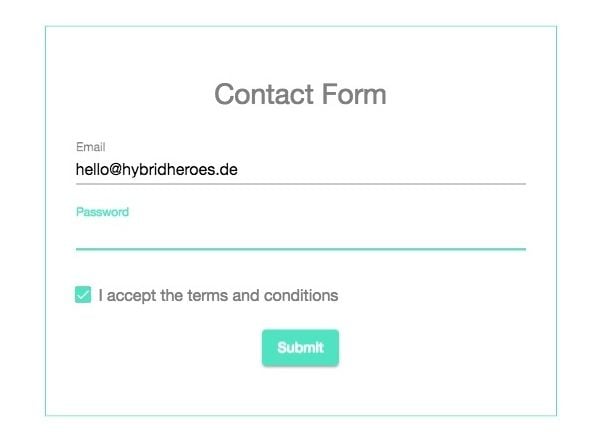
Now go to app.component.html and remove the default content. Add two mat-form-field elements (one for the username and another one for the email) and wrap them around a simple container.
<div class="form-container">
  <mat-form-field>
    <input matInput placeholder="Email">
  </mat-form-field>
  <mat-form-field>
    <input matInput placeholder="Password">
  </mat-form-field>
</div>
Below the code you've just added create a checkbox and a button from the Material library using the primary color.
<mat-checkbox color="primary">I accept the terms and conditions</mat-checkbox>
<button mat-raised-button color="primary">Submit</button>
As you can see the form fields, button and checkbox are using the $hybrid-heroes-green colour on the text inputs, since you established it as the app's primary colour on custom-theme-scss. You can also use "warn" or "accent" in the color attribute of the Material elements.
Now that you know the basics of Angular Material you can experiment a bit more with its components and themes. Try extending the form with some of the library's own components like Radio button, Select or Date Picker. You can check the full list of components can be here.
If you are interested in getting your own app developed or need UI/UX Design for your app, feel free to contact us here.
Want to know more about UI/UX Design? Check out this blog post about the future of design tokens or this blog post for an introduction to Storybook JS folder structure.