Unlock Dark Mode’s Full Potential: iOS 18’s New Tinted Icons

As you might have heard already, iOS 18 is about to be released in September 2024. The update will be available for all devices that are already compatible with iOS 17 and will come with new exciting and valuable features such as Apple Intelligence. But the star of the show in today's blog post? The eye-catching makeover of app icons!
What's new about iOS 18 app icons?
With the iOS 18 update, you will be able to give your users the possibility to customize the look of your app icon in a completely new way! Dark mode has been a game-changer for websites and apps, transforming how we experience our screens. But Apple isn’t stopping there. With iOS 18, they’re pushing the boundaries of customization even further by introducing dark and tinted app icons. This new feature is similar to the Android adaptative icon.

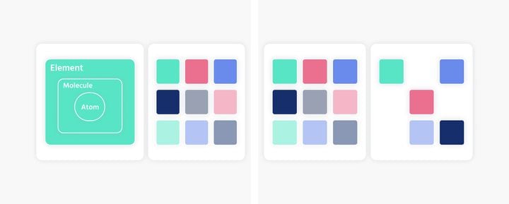
As you can see in this image, users will be able to completely customize their app icons. You can choose between dark and light mode, automatic to match your system theme, or tinted.
While dark and light icons are set by app developers and locked in place, tinted icons will give your users the freedom to personalize their app icons like never before.
To unlock this feature for your users, you’ll need to create dark and tinted versions of your app icon. Ready to give your app a fresh new look? Let’s dive into how you can make it happen in the next section!
Revamp Your Icon Style: A Step-by-Step Guide to Dark and Tinted Versions
Xcode 16
In order to make use of the new app icons feature, the simplest solution is to upgrade your Xcode version to 16.
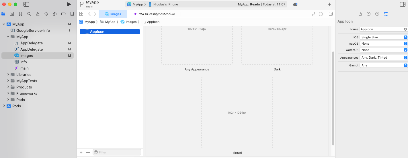
First, select your app icon in the Project Navigator (it should be in your Asset Catalog).
Then go to View > Inspector > Attributes from the Xcode menu.
In the iOS dropdown, select Single Size and Any, Dark or Tinted in Appearance.
After you've selected the option for Appearance, 2 images will show. This is where you can add the dark and tinted app icons.
As you can see, setting this up with Xcode 16 is a breeze. But if you’re using Xcode 15, don’t worry – you’ve still got a way to make it happen. Here’s how you can do it:
Xcode 15
As a first step, you need to change the content of your Content.json file which you can find with the following path:
ios_root_folder/Assets.xcassets/AppIcon.appiconset/Contents.json
ORios_root_folder/Images.xcassets/AppIcon.appiconset/Contents.json
Now, you need to replace the content of the file with the following code:
{
  "info" : {
    "author" : "xcode",
    "version" : 1
  },
  "images" : [
    {
      "idiom" : "universal",
      "platform" : "ios",
      "size" : "1024x1024"
    },
    {
      "appearances" : [
        {
          "appearance" : "luminosity",
          "value" : "dark"
        }
      ],
      "idiom" : "universal",
      "platform" : "ios",
      "size" : "1024x1024"
    },
    {
      "appearances" : [
        {
          "appearance" : "luminosity",
          "value" : "tinted"
        }
      ],
      "idiom" : "universal",
      "platform" : "ios",
      "size" : "1024x1024"
    }
  ]
}
Once you changed your Content.json file, it will allow you to add the dark and tinted icon in Xcode 15.
If you need additional information about good practices for designing dark and tinted icons for your app, check Apple's guidelines.
Perfecting Your Icons: Essential Guidelines for Dark and Tinted Designs
To optimize both dark and tinted designs of your icons, Apple provides some guidelines to follow. We have briefly summarized the most important information below:
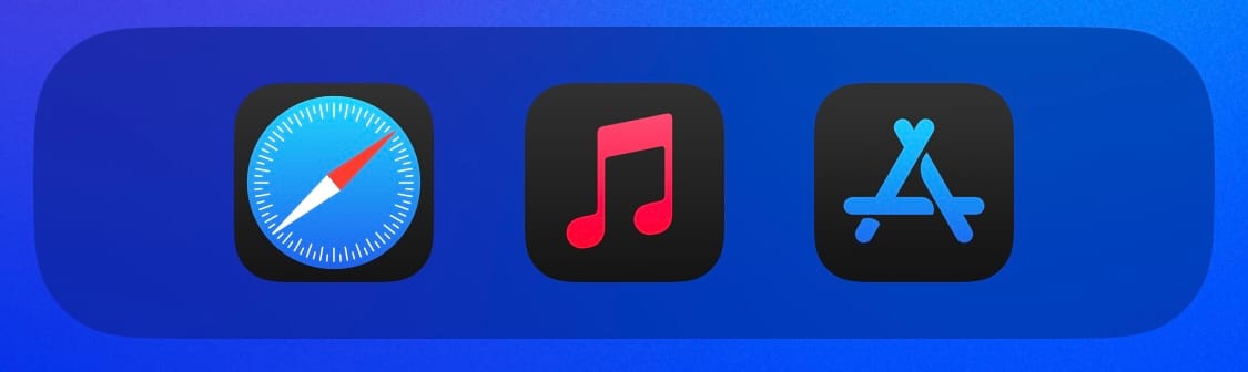
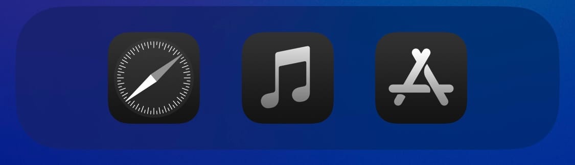
As a starting point, you'll need a simplified version of your icon that still retains its key features. For dark icons, start with your light icon (the one you already have). Since dark icons will be displayed on dark backgrounds, you need to ensure the design stands out clearly against the dark layer instead of blending into it. For example, the Apple Music icon uses its red color in the first layer instead of the background, and the App Store uses the blue.
Avoid using images that are too bright, as they may not display well. Also, remember to include a transparent version of your icon.
For tinted icons, Apple advises using a grayscale image, fully opaque. Same as the dark icon, the system will provide the background and generate the tinted icon.
If you want to read more details about how to optimize both dark and tinted designs of your icons, check Apple's guideline.
Get ready for iOS 18 and dark and tinted app icons
Whether this feature is truly essential or just a nice touch is up for debate. However, one thing is clear: you'll want your app to have it as soon as possible to enhance your users' experience.
So far, it seems like Apple has not communicated yet on what will happen to applications that have not set up a dark and/or tinted icon. Two options seem likely plausible; either iOS will automatically try to adapt the design of your default icon, and you'll have no control over it – or it's just going to use the default icon for all settings.
In the first scenario, you risk losing control over your branding because Apple will handle the default icon for you. They’ll attempt to apply dark or tinted modes to your icon, which could potentially alter its design in ways you don’t intend.
In the second scenario, your icon maintains the original design you provided. However, you might face a different issue. Let’s take another look at the screenshot we saw earlier to see what we mean:
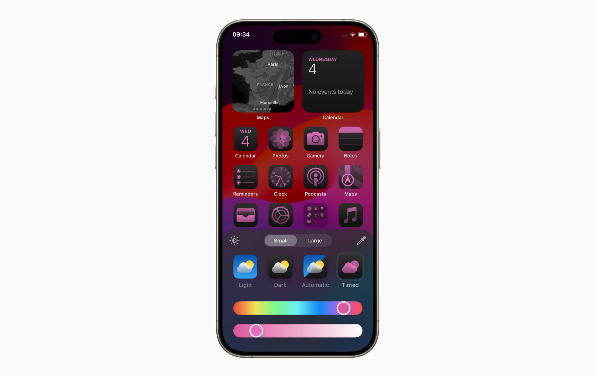
As you can see, tinted icons will offer a way to customize the look of your phone's home screen. In this screenshot, the home screen looks great because the colors are harmonic — you can even match the background image with the color of the app icons.
Now imagine the home screen, but with an app in the middle being blue and white because this is the default app color, and there is no tinted icon available. This app will look like a stain on the home screen. And you definitely don't want your app to be a stain on your users phones. At best, it will have a negative impact on your branding, and in the worst-case scenario, it will be enough of a reason for your user to go to your competitor.
No matter how Apple will handle applications without the dark and tinted icon, you don't want to be part of it. Now that you're warned, you better get ready for iOS 18 and its dark and tinted app icons!