Foldable Smartphones: Expanding Possibilities, Redefining Design Standards

Foldable smartphones are quickly rising in significance, unlocking exciting new possibilities while presenting fresh challenges for designers. Unlike conventional smartphones, which have followed steady design standards for years, foldable devices introduce dynamic, flexible experiences that push the boundaries of creativity. With expanded screen space comes greater complexity, requiring designers to rethink usability, user experience, and visual aesthetics to create seamless, intuitive interactions. As foldable tech reshapes the future of mobile design, innovation is no longer optional—it's essential.
But what do designers need to consider? Let's have a look at the two types of foldable smartphones first:
Foldable Smartphones Explained - The Two Essential Types
Foldable smartphones can be divided into two main categories:
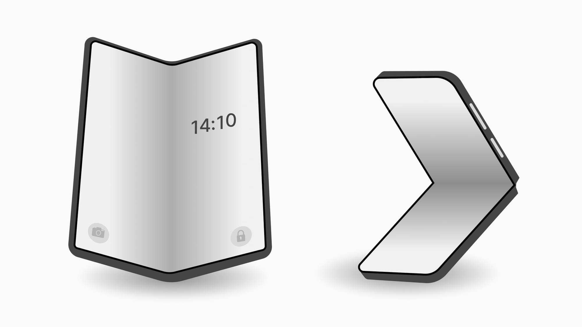
- Vertical Folding (Tablet-like Devices): Devices like the Samsung Galaxy Z Fold series unfold from a regular-sized smartphone into a larger, tablet-like display. This type requires a seamless experience that adapts from a smaller to a larger screen.
- Horizontal Folding (Flip Phones): Devices like the Samsung Galaxy Z Flip and Motorola Razr use a vertical flip design, where the phone unfolds into a standard smartphone display but becomes more compact when folded.
Each of these forms brings its own challenges, forcing designers to rethink content flow, layout, and interaction patterns.
Now that we've covered the two main categories of foldable smartphones, let's have a look at different aspects designers need to consider further:
From Folded to Unfolded: Achieving Fluidity in Foldable Smartphone Design
One of the most crucial aspects of designing for foldable smartphones is continuity. Since these devices frequently switch between different screen modes, the switch from folded to unfolded should feel seamless. Users should not notice sudden disruptions when switching between form factors, such as a social media feed or a video player.
Designers need to make sure that the user interface is adaptable to various screen sizes. When the user unfolds the device, the content should automatically adjust and resize. This requires a fluid grid system where UI elements can adjust based on screen size while maintaining usability.
- Consistent Visual Hierarchy: The unfolded state often provides significantly more screen space, enabling designers to reorganise elements to make use of the additional area. However, maintaining a consistent hierarchy in both states is crucial to prevent confusion among users.
- Intuitive Transitions: Transition animations can play a key role in making the switch between folded and unfolded states feel natural. Use smooth transitions that clearly indicate the shift from one form factor to another, making it easy for users to understand the flow of information.
Effortless Multitasking: Designing User Interfaces for Foldable Split-Screen Use
Foldable smartphones encourage multitasking, making split-screen features more attractive. Designers have to consider how multiple apps or windows can be used simultaneously on these larger screens. The user interface has to function effectively alongside other applications, ensuring that elements don't become too cluttered or overwhelming.
- Flexible Layout Design: Make sure that your app functions in split-screen mode by modifying elements and layouts to match the available space. The user should be able to run two apps side by side without losing functionality or readability.
- Interactive Elements: Buttons, navigation bars, and other interactive elements should remain easily reachable even in split-screen mode. Avoid overcrowding the interface with touch targets that are too small, as they become impractical in folded or split-screen modes.
The Fold Dilemma: Designing User Interfaces That Bypass Visual Interruptions
The folding mechanism can result in a crease or gap in the middle of the screen, which requires special attention during layout design. Avoid placing important visual or interactive features directly in the fold area, as it can make it challenging for users to engage with them.
- Design for Split Views: Design layouts that naturally distribute content across both screen segments in order to predict the fold. Text or content can be adjusted to avoid crossing the fold, which could disrupt the visual flow.
- Minimal Use of Complex UI Elements in the Fold Area: Avoid placing crucial buttons, text fields, or interactive elements in the fold, as this area may be less responsive or aesthetically pleasing.
Adapting on the Fly: Creating Responsive Layouts for Every Orientation
Foldable devices often allow for smooth transitioning between portrait and landscape modes. As a designer, it is important to make sure that your app or website works well in both orientations. This involves creating responsive layouts that remain visually appealing and functional, regardless of how the user holds the device.
- Adaptable Grids: Using a fluid, responsive grid system is essential for adjusting designs for different orientations. In portrait mode, a two-column layout may transition to a three- or four-column layout in landscape mode.
- Content Rearrangement: Ensure that text, images, and other media adapt and rearrange seamlessly across various modes without cutting off important information or pushing essential UI elements off-screen.
Designing for Movement: Gesture Navigation and Performance in Foldables
Foldable phones often emphasise gesture-based navigation. Designers need to consider how users will engage with the app through swipe, pinch, and tap gestures, designing the experience to be fluid and intuitive. As the available screen space changes between folded and unfolded states, this affects the placement of touch targets and gesture zones. Larger, easily accessible touch targets are particularly necessary in the folded state, where the screen is smaller.
Although not directly a design element, performance plays a vital role in designing for foldable smartphones. The transition from folded and unfolded states should not cause delays or slow loading of content. Smooth performance is essential to maintaining the continuity and fluidity of the user experience.
Conclusion
Designing for foldable smartphones is an exciting challenge. These devices necessitate designers to go beyond static layouts and create adaptive, dynamic experiences that function across different form factors. By focusing on continuity, flexibility and responsiveness, and considering the unique aspects of foldable devices like the fold area and multitasking capabilities, designers can create experiences that make the most of this technology. Currently foldable phones make up only 1.5% of the smartphone market, however this number is expected to grow to 4.8% by 2028 (source), offering an opportunity for future growth and innovation.