Understanding the Terminology Divide in UI Design: iOS vs. Android
In mobile application design, the components that make up the user interface might seem universal at first. But when you dig deeper into iOS and Android, you quickly realise that the same components can be called very different names on each platform. This variation, while seemingly minor, can cause significant challenges for designers and developers who need to create apps that work seamlessly across both systems.
In this post, we’ll explore some of the most common examples of these naming differences, discuss the challenges they pose, and suggest ways to bridge the gap when working with both iOS and Android in UI design.
The Root of the Terminology Divide
The discrepancy in terminology arises from the different design philosophies that Apple and Google champion. Apple’s Human Interface Guidelines (HIG) focus on simplicity, clarity, and user control, often using more generic terms. Google’s Material Design, by contrast, is centred around flexibility and consistency, leading to more system-oriented names for components. As both platforms evolved, these naming conventions stuck, even when the components themselves remained functionally similar.
While this divide is understandable, it can create a headache for cross-platform designers and developers, who need to keep both naming systems in mind.
Common Examples of Terminology Differences
Let’s dive into some of the widely used components where terminology diverges between iOS and Android:
Toggle vs. Switch

This component allows users to toggle between two states—on or off—yet the terminology varies. iOS uses Toggle, which emphasises the action of changing between states, while Android calls it a Switch, evoking a more tangible, mechanical action. The differences in names can trip up designers when creating shared assets. Do you design for a "Toggle" or a "Switch"—and should they look the same across platforms?
Sidebar vs. Navigation Drawer
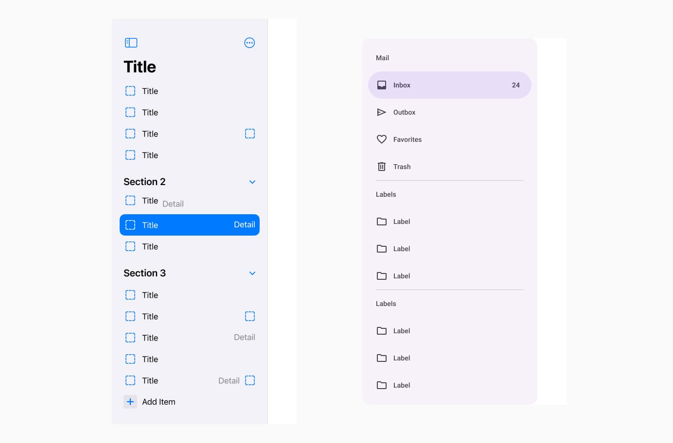
Both of these components provide quick access to different sections of an app, typically hidden off-screen. iOS refers to it as a Sidebar, suggesting a fixed panel beside the content. Android calls it a Navigation Drawer, emphasising its role as a sliding container. Despite serving the same purpose, the different names reflect each platform's unique approach to navigation and layout.
Tab Bar vs. Navigation Bar
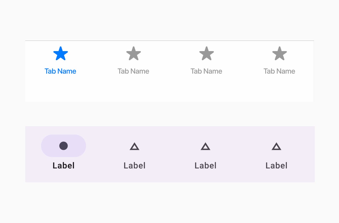
Both systems use a set of navigation buttons at the bottom of the screen to switch between top-level sections of an app. iOS calls it a Tab Bar, while Android refers to it as Navigation Bar. While functionally similar, the design expectations vary slightly between the platforms, and the term Navigation Bar in Android can even imply more customisation, such as with the inclusion of a floating action button.
Pull-down Button vs. Dropdown
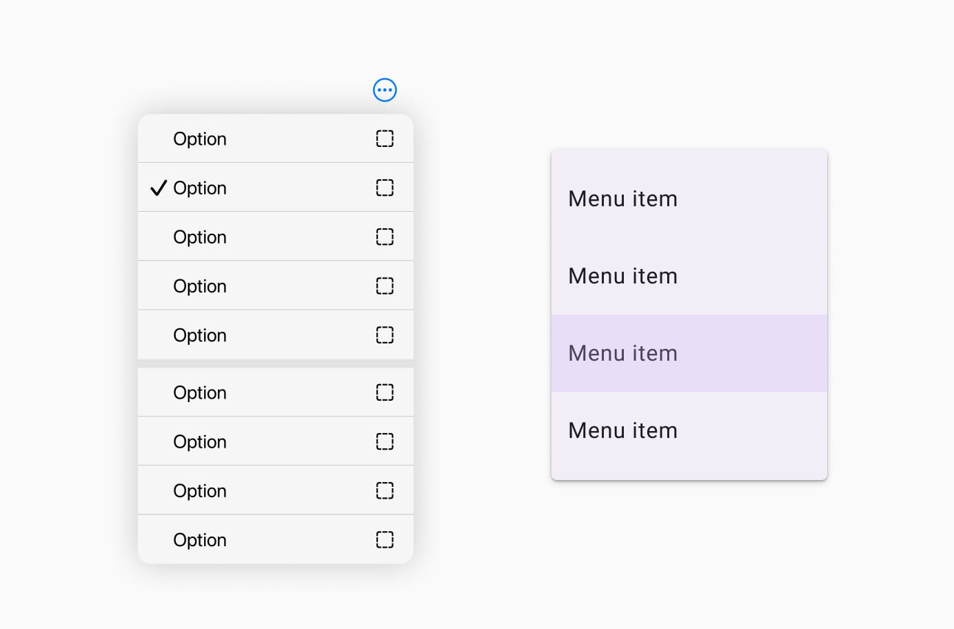
The Pull-down Button in iOS and the Dropdown in Android serve the same purpose: allowing the user to select from a list of options by revealing a list when the button is tapped. However, iOS uses the term Pull-down Button, which visually conveys the action of pulling down a list, while Android uses Dropdown, a term more tied to web-based UIs that describes the expansion of a menu beneath the button.
Designers often find themselves in a dilemma when it comes to ensuring these components look and behave consistently across both platforms. Should the pull-down button behave exactly the same way on both iOS and Android? Or is it better to design slightly different interactions to align with the platform-specific user expectations?
The Challenges for Designers and Developers
The primary challenge here is the sheer inconsistency. Designers may face confusion when creating wireframes or prototypes, as they need to remember that the same component may have different names depending on the platform. Developers, too, must grapple with the responsibility of ensuring that each system is correctly implemented while trying to maintain as much uniformity as possible across platforms. The differences in terminology can add unnecessary complexity, leading to a higher risk of inconsistencies in design and functionality.
This is particularly problematic for teams working with both iOS and Android, as it requires balancing two distinct sets of guidelines and ensuring the user experience feels native on both platforms. Additionally, it can be difficult to determine whether to design components that strictly adhere to one platform's conventions or aim for a unified look that transcends both systems.
Solutions for Overcoming the Terminology Divide
There are a few strategies that can help overcome these naming issues and keep design and development moving smoothly:
- Clear Cross-Platform Design Systems: Establishing a shared design system for cross-platform apps that incorporates both iOS and Android conventions can help streamline the process. Tools like Figma or Sketch allow designers to create reusable components that adhere to both platforms’ guidelines. It can be helpful to label components based on function rather than platform-specific names, e.g., “On/Off Switch” instead of “Toggle” or “Switch.”
- Education and Collaboration: It’s essential that both designers and developers are educated about the nuances of each platform’s design philosophy. Encouraging regular communication between teams can clarify which components should adhere to platform-specific norms and which ones should be unified across both platforms. Working in sync allows for smoother implementation and greater consistency across the final product.
- Use of Cross-Platform Frameworks: For teams building truly cross-platform apps, leveraging frameworks like Flutter or React Native can help simplify the design process. These tools often provide pre-built components that work across both platforms, abstracting away some of the platform-specific naming conventions. The goal is not to completely disregard native conventions but to focus on delivering a consistent user experience that respects both ecosystems.
- Embrace Platform-Specific Customisation: In some cases, it may be beneficial to embrace the platform-specific design guidelines in order to create the best experience for users on each system. This might mean designing separate components for each platform, ensuring that the final design is fully optimised for iOS or Android without sacrificing functionality. Ultimately, consistency across platforms should be balanced with the need to respect each platform’s unique conventions.
Conclusion
The naming differences between iOS and Android UI components may seem trivial, but they reflect deeper design philosophies that can create significant challenges when designing for both platforms. These discrepancies can be confusing for designers and developers, requiring careful attention to both the functional and terminological needs of each ecosystem.