Implement inline icons nicely in React Native (and other environments, too)
Learn about the issues we had with implementing inline icons in React Native and how we solved them.
For a client we implemented a visual indicator to distinguish between different kinds of inline text links. Since the client is able to tag links herself in the CMS our initial approach was to add an SVG-icon after every tagged link on the app's side.
Even though this sounds pretty straightforward we were facing three problems along the way:
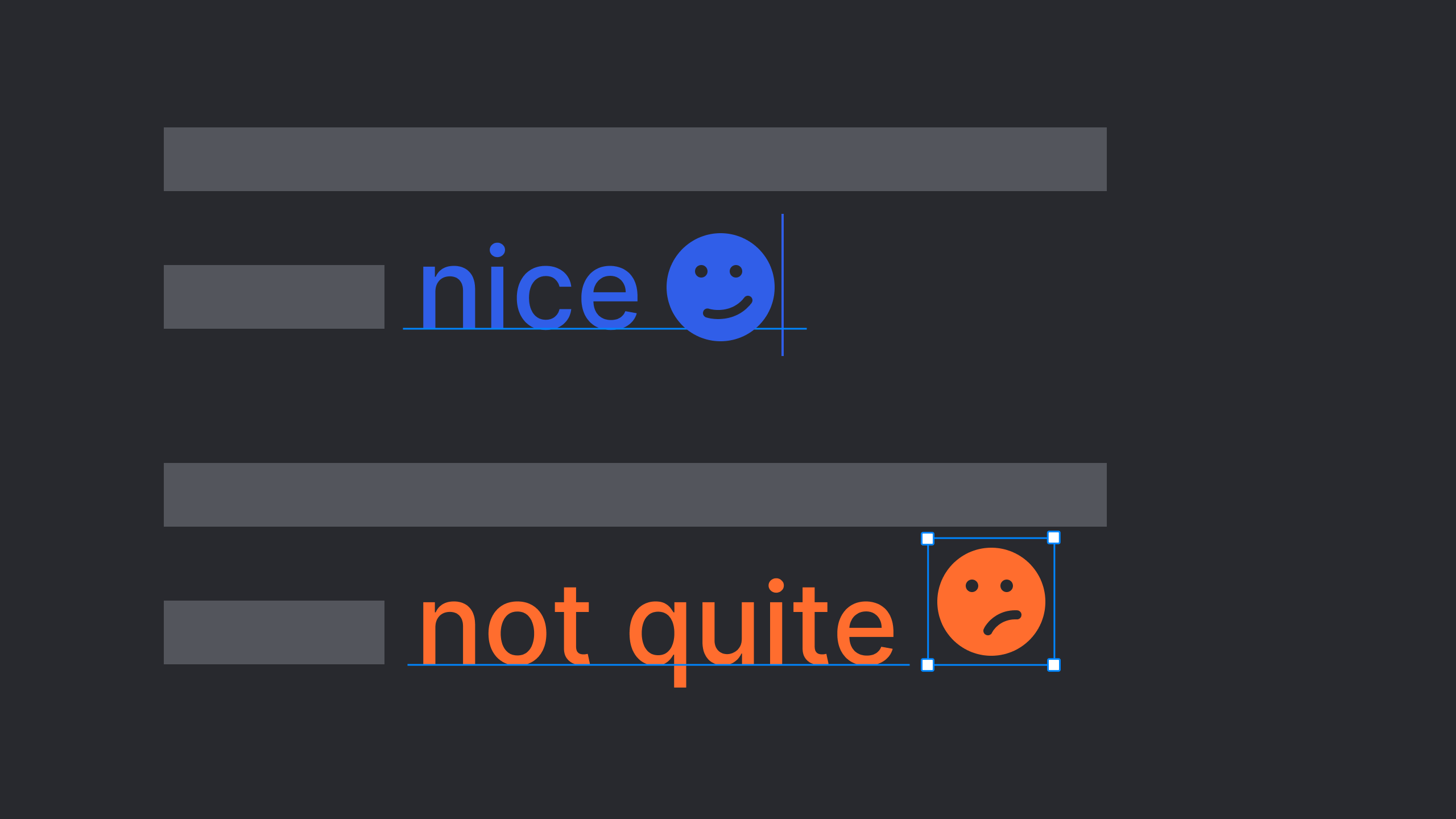
- Messed up baselines: Since a fonts line-height is calculated from the baseline it is hard to align an icon that is supposed to actually take some space in the fonts descender area regarding optical alignment reasons. This caused an unpleasant baseline shift for only the link part.
- The whole link could not wrap because the the icon is an image component that does not respect the boundaries of the Text it is contained in.
- Increased complexity in RTL: For languages like Arabic the text and layout direction of many if not most elements changes from left-to-right to right-to-left. The inline icon however would stay on the right side of the link instead of the left. We assume this happens because in the context of text other elements do not get mirrored. It would have needed some extra fiddling to get it to appear properly.

Left: baseline offset, middle: long link does not wrap, right: RTL text direction not respected
Instead of taking care of all the special cases and weird behaviors we decided to go for an icon font based on the apps font Noto Sans.
This approach allows us to only add a glyph in another text component after the link from any unicode slot which always behaves like text – because it actually IS text. To create this icon font we used the font creation tool Glyphs and made sure of two things:
- To have the icons align nicely in the text we used the same dimensions as Noto Sans and the same optical weight as well.
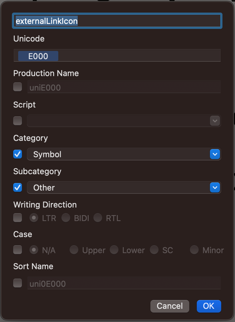
- Since almost every Unicode slot refers to an actual letter it is important to create icons in the Private Use Area (U+E000–U+F8FF) because otherwise search engines would read the icon as a letter which might have some negative SEO results.
How to create an icon font in Glyphs
In the Glyphs app after creating a new font file open the »Font Info« panel (cmd+i), go to »Master« and make sure to have the same specifications as the font you want to implement the icons in. Alternatively you could open the original font in Glyphs, remove all the glyphs redundant for the icon font and you are good to go. If you choose the second approach make sure to check the font's license model first in case it does prohibit editing.
After adding a new glyph (shift+opt+cmd+n) select it and open the »Info for Selection« (opt+cmd+i). You can name the glyph however you want but make sure to have a value between E000 and F8FF in the Unicode text field. If you have taken care of this you are good to go drawing your icon and continue adding as many as you like.
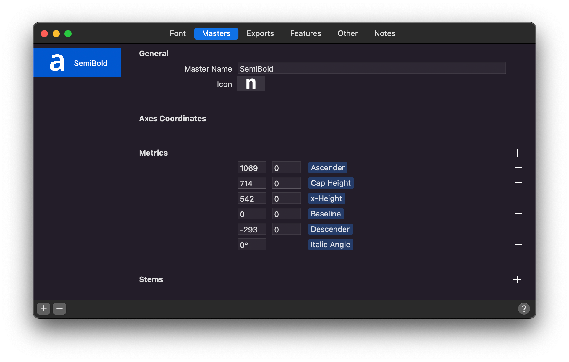
Left: Font Info, right: Info for Selection
Using an icon font in text and design applications
Once you have exported and installed the typeface you can use it in all applications similar to all other typefaces. However, since the icons use Personal Use Unicode character slots it is not possible to simply type them with the standard keyboard:
- go to SystemPreferences/Keyboard/InputSources
- press (+) to add a new keyboard
- scroll down to other and select Unicode Hex Input
- in the Status Bar select the U+ keyboard
- while pressing the option key you are now able to address Unicode characters e.g.: <hold option>+000
Implementing an icon font in React Native
After creating the font, we can use the icons in our React Native app.
For that purpose, we will use react-native-vector-icons which comes with useful convenience methods to create components from our icons.
First, add the font to your project's asset folder. Depending on your React Native version you need to run
$ react-native link
for RN version <0.69 or
$ npx react-native-asset
for RN >=0.69 to link the assets to your project.
Next, install react-native-vector-icons if you don't already use the library in your project:
$ npm i react-native-vector-icons
Creating a custom icon component
We will now use react-native-vector-icons to create a custom <Icon> component. You can already add your icons into text using String.fromCharCode(code) but we like to have a convenient component so we don't need to look up these codes. First, we need to create a glyphMap that maps names of our choosing to the Unicode characters that our icons are mapped to in the font.
const glyphMap = {
  'external-link': 57344,
  'internal-link': 57345,
  tooltip: 57346,
  'tooltip-mirrored': 57347
};
We converted the Unicode hex code point values into integers but you may also want to parse it in code using parseInt("0xE000", 16).
Now we can use createIconSet to create the component from the font and the glyphMap.
// CustomIcon.ts
import { createIconSet } from 'react-native-vector-icons';
import { IconProps as IconPropsUntyped } from 'react-native-vector-icons/Icon';

const glyphMap = {
  'external-link': 57344,
  'internal-link': 57345,
  tooltip: 57346,
  'tooltip-mirrored': 57347
};

type CustomIconNames = keyof typeof glyphMap;
type CustomIconProps = IconPropsUntyped & {
  name: CustomIconNames;
};

export { CustomIconProps };
export default createIconSet(
  glyphMap,
  'YourIconFont',
  'YourIconFont.ttf'
);
We also included some typing based on the IconProps type react-native-vector-icons provides.
Creating a Link component
Since the new <CustomIcon> component we just created is based on <Text>, we can use it directly next to other <Text> based components! Let's try it by creating a <Link> component that displays an icon next to a text:
// Link.tsx
import React, { FunctionComponent } from 'react';
import { StyleSheet, Text, TextProps } from 'react-native';
import CustomIcon, { CustomIconProps } from './CustomIcon';

const Link: FunctionComponent<TextProps> = (props) => {
  const iconProps: CustomIconProps = {
    name: 'external-link',
    size: 16,
  };
  return (
    <Text {...props} style={[props.style, styles.text]}>
      {props.children}
      {/* Hairspace character */}
      {String.fromCharCode(8239)}
      <CustomIcon {...iconProps} />
    </Text>
  );
};

export default Link;

const styles = StyleSheet.create({
  text: {
    fontFamily: 'YourIconFont',
    fontSize: 16
  }
});
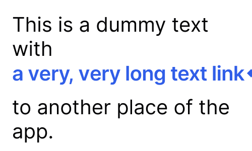
Our font includes a non-wrapping hairline space that does not wrap so we can have some space between the text and the icon while preventing them to be separated across lines. Since our <CustomIcon> is based on <Text>, it will also inherit styles and color from the parent <Text> component!
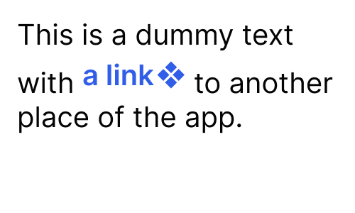
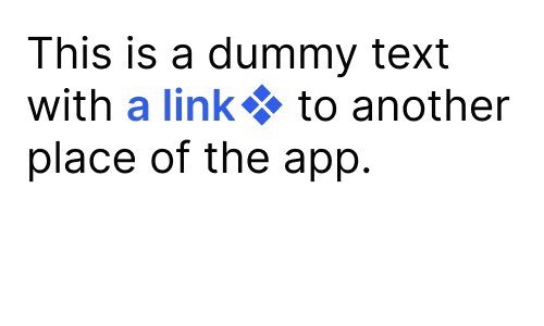
Now the link and the icon indicator blends in nicely into the text as intended by design:
In conclusion, we think it paid off well going for this collaborative approach to combine the designer's and developer's knowledge instead of trying to find a solution only in code. Let us know if you would have done it differently!
If you want to read more about development with React Native, check out this blog post about custom fonts in react native or this blog post about lock screen audio controls: React Native music control.