Building a React Native UI Component Library for a Family of Apps

Key Takeaways
Why build a shared React Native UI component library?
To reuse components, design tokens, and interaction patterns across multiple apps while keeping the design system consistent.
How are design tokens managed?
Tokens are exported from Figma as DTCG JSON and automatically converted into fully typed TypeScript.
How does the library support multiple brands?
Each brand uses its own color scale, while shared semantic tokens let components remain brand-independent.
What technologies power the component library?
React Native, Unistyles 3.0, Storybook 10, Expo, TypeScript, and React Native Builder Bob.
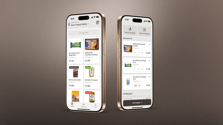
Over the recent years we have created multiple React Native apps for one of our customers. Their user interface has been evolving over time, reflecting the current trends at the time they were originally built. Now they are going through a coordinated redesign. The new designs share a common design language with same components and design tokens. Rather than having each project implement it separately, we decided to build a shared UI component library installed as a dependency and used across all apps (more about our capabilities in this area: UX Design Agentur). This is how we put it together.
Table of Contents
Why a Shared Library
The apps are being redesigned to follow the same design system. That means same Figma components, tokens and interaction patterns. Building each app's UI from scratch would mean duplicating work and inevitably drifting apart as teams interpret the designs differently.
We wanted one place where components live, one place where design tokens are defined, and one npm install to bring it all into any app. The library also supports brand-specific color overrides to support different app branding.
Design Tokens: From Figma to TypeScript
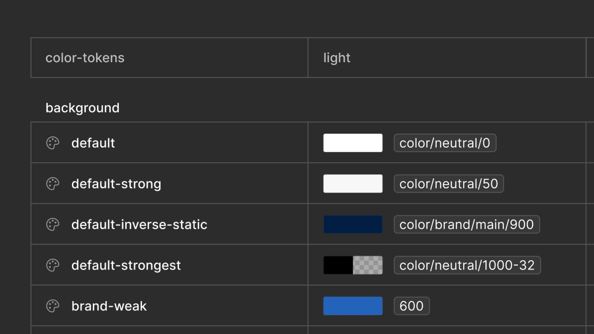
Design tokens are the foundation. Colors, spacing, border radii — everything a component needs to look right comes from tokens rather than hardcoded values.
Our designers maintain these tokens in Figma and we export them as JSON in the DTCG (Design Token Community Group) format. We then run a build script that reads those JSON files and generates TypeScript:
export const text = {
  default: '#001E42',
  'default-weak': '#717171',
  interaction: '#0055D9',
  // ...
} as const;
The generated files use as const, so every token is fully typed. Components reference colors.text.interaction and TypeScript catches any typo or non-existent token at compile time.
We looked at tools like Style Dictionary but they felt heavy for what we actually needed. Since all we needed was to parse Figma variables, we got AI to write a simple node script. It walks the DTCG JSON, resolves references, and writes out TypeScript files.
The workflow is simple: designers update Figma, we export JSON, run npm run tokens:build and commit the generated files.
Theming and Brand Support
The library ships with a default theme plus a theme for each supported brand. A brand is defined as a color scale from 50 to 900, while components continue to use semantic names such as colors.text.brand and colors.surface.brand. They never need to know which shade a particular brand uses.
A generated dependency map connects those two layers by recording which brand shade supplies each brand-dependent semantic token:
export const brandDependentTokens = [
  { category: 'text', token: 'brand', brandStep: '700' },
  { category: 'foreground', token: 'brand', brandStep: '600' },
  { category: 'surface', token: 'brand', brandStep: '50' },
  // ...
] as const;
For each brand, buildTheme() copies the base semantic colors and replaces only the entries listed in this map. In simplified form, it looks like this:
function buildTheme(brandColors: BrandColorScale): Theme {
  const colors = {
    text: { ...baseColors.text },
    foreground: { ...baseColors.foreground },
    surface: { ...baseColors.surface },
  };

  for (const { category, token, brandStep } of brandDependentTokens) {
    colors[category][token] = brandColors[brandStep];
  }

  return { colors, spacing, radius, typography };
}
Spacing, radius, typography, and every non-brand color remain unchanged. The result is a complete, consistently shaped theme for every brand, which keeps both component styles and TypeScript types independent of the active brand.
Consumers select a theme by wrapping the app in the library provider:
<UIProvider brand="myBrand">
  <App />
</UIProvider>
The provider calls UnistylesRuntime.setTheme(brand) whenever the brand prop changes. Unistyles then updates styles that depend on the theme, so switching brands does not require conditional color logic inside components.
Styling With Unistyles
We use Unistyles 3.0 to make theming straightforward — stylesheets have direct access to the current theme's tokens and with a variant system we can keep component code clean. Instead of writing conditionals for every visual state, we declare variants in the stylesheet:
const styles = StyleSheet.create(({ colors, radius }) => ({
  container: {
    borderRadius: radius['100'],
    variants: {
      type: {
        Solid: { backgroundColor: colors.foreground.interaction },
        Outline: { backgroundColor: 'transparent', borderWidth: 1 },
        Ghost: { backgroundColor: 'transparent' },
      },
    },
  },
}));
And activate them in the component with styles.useVariants({ type, size, state }).
All themes are registered at startup:
StyleSheet.configure({
  themes: buildThemes(),
  settings: { initialTheme: 'main' },
});
Typography
We use two font families: a serif for headlines and a sans-serif for everything else. The typography system defines named variants — things like HeadlineM, BodyS, LabelM — each as a complete style object with font family, size, line height, and letter spacing:
export const typography = {
  HeadlineM: {
    fontFamily: 'Merriweather-Bold',
    fontSize: 22,
    lineHeight: 28,
    letterSpacing: 0,
  },
  BodyM: {
    fontFamily: 'Inter-Regular',
    fontSize: 16,
    lineHeight: 24,
    letterSpacing: 0,
  },
  // ...
};
The whole object is then folded into every theme alongside colors, spacing and radius, so it's available from any stylesheet:
// ...
import { typography } from '../typography';

const buildTheme = (brand) => ({
  colors,
  spacing,
  radius,
  typography,
});
A TypeScript helper derives a TypographyVariant union ('HeadlineM' | 'BodyM' | …) directly from the keys of the object, so consumers get autocomplete and typos fail at compile time.
With typography sitting on the theme, we can hand the entire map to Unistyles as a variant group. That makes the Text component really simple:
const Text = ({ type = 'BodyM', style, children, ...props }) => {
  styles.useVariants({ typography: type });
  return (
    <RNText style={[styles.text, style]} {...props}>
      {children}
    </RNText>
  );
};
const styles = StyleSheet.create(({ colors, typography }) => ({
  text: {
    color: colors.text.default,
    variants: {
      typography,
    },
  },
}));
Example App and Storybook
The repo includes an example app — an Expo project that pulls in the library locally and serves as the main development environment. It's powered by Storybook 10 for React Native, so when you launch it in the simulator, you get a browsable catalog of every component in the library.
Each component has a .stories.tsx file living right next to it in src/. Stories define the component's props as Storybook controls, so you can toggle between variant types, sizes, and states without writing throwaway test screens.
The example app also handles the setup that the library itself doesn't own — loading custom fonts, configuring Expo Router, and providing the right environment for Storybook to render. It's a good reference for how consumers should integrate the library.
Storybook also supports building a web version of the catalog, which is useful for sharing component previews with designers or stakeholders who don't have a simulator handy.
How It's Built and Packaged
The library is built with React Native Builder Bob, which is purpose-built for publishing React Native libraries. It outputs two targets:
- CommonJS — the actual JavaScript that runs at runtime, with ESM interop enabled
- TypeScript declarations —
.d.tsfiles so consumers get full type safety
The source lives in src/, and Bob outputs everything to lib/. The package.json is set up so that main points to the CommonJS entry and types points to the declaration entry. The package also uses the exports field for modern bundler support.
Storybook files (.stories.tsx) are co-located with components in src/ but excluded from the build output — consumers never ship story code.
The build runs automatically on npm pack and npm publish via a prepack script, so there's no way to accidentally publish stale output.
The library declares its heavy dependencies as peer dependencies — React, React Native, Unistyles, etc. This avoids duplicate copies in the consumer's bundle and lets apps control their own versions.
What We Learned
Having a single source of truth actually works. Before the library, "we use the same design system" was aspirational. Now it's enforced — if a component looks wrong, there's one place to fix it.
Generating tokens beats maintaining them by hand. The Figma-to-TypeScript pipeline is simple, but it removes a whole class of "the color is wrong" bugs. Designers change a value, we regenerate, and it's correct everywhere.
Unistyles variants clean up component code significantly. Before we had variants, components with multiple visual types were full of ternaries and style arrays. The variant system moves that complexity into the stylesheet where it's more readable.
The library is still evolving — we're adding components as the apps need them. But the foundation is solid, and the pattern of "generate tokens, build themes, write variant-driven components" has held up well.
FAQ: Building a React Native UI Component Library
What is a shared React Native UI component library?
A shared React Native UI component library is a reusable package containing components, design tokens, themes, typography, and styling logic that can be installed across multiple React Native applications. Instead of rebuilding buttons, text styles, inputs, cards, and other UI elements in every app, teams maintain them in one central library.
Why use a shared component library across multiple React Native apps?
The main benefit is consistency. When several apps use the same design system, implementing components separately can lead to duplicated work and visual differences between projects. A shared library creates a single source of truth, so improvements or fixes can be made once and distributed across all consuming apps.
How do you keep Figma design tokens in sync with React Native?
In our setup, design tokens are exported from Figma as JSON using the DTCG format. A Node.js script then parses the files, resolves token references, and generates TypeScript objects. When designers update tokens in Figma, we export the JSON again and regenerate the TypeScript files.
Do you need Style Dictionary to manage design tokens?
Not necessarily. Style Dictionary is useful for complex design systems or projects that need to transform tokens into many different platform-specific formats. For our requirements, a small custom script was sufficient because we primarily needed to convert Figma variables into typed TypeScript.
Why generate TypeScript from design tokens instead of maintaining them manually?
Generating the files reduces manual work and helps prevent inconsistencies. Using as const also gives TypeScript knowledge of the exact available token names, which means invalid or misspelled tokens can be caught during development rather than becoming visual bugs later.
How do you support multiple brands without duplicating components?
Components reference semantic tokens such as colors.text.brand or colors.surface.brand rather than specific color values. Each brand supplies its own color scale, and the theme-building logic maps those colors to the appropriate semantic tokens. The component implementation therefore stays the same regardless of which brand is active.
Can the active brand or theme be changed at runtime?
Yes. The application wraps its UI in a provider and selects the required brand. When the brand changes, the provider updates the active Unistyles theme. Components using theme-dependent styles are then updated without needing brand-specific conditionals throughout the component code.
Why use semantic color tokens instead of direct color values?
Semantic tokens describe how a color is used rather than what the color actually is. For example, a component can use colors.text.interaction instead of referencing a particular shade of blue. This makes the design system easier to update, supports multiple brands, and keeps component styling independent of specific color values.
What is Unistyles used for in the library?
Unistyles provides access to the active theme inside React Native stylesheets and supports style variants. This allows components to define states such as Solid, Outline, or Ghost within their stylesheet instead of filling component code with conditional styling logic.
How are component variants handled?
Variants are declared inside the Unistyles stylesheet and activated from the component using styles.useVariants(). Properties such as component type, size, state, or typography can therefore be represented as structured variants while keeping the JSX relatively simple.
How is typography shared across applications?
Typography styles are defined centrally as named variants such as HeadlineM, BodyM, and LabelM. Each variant contains the font family, font size, line height, and letter spacing. The typography map becomes part of every theme, allowing components across all applications to use the same typographic system.
How does TypeScript improve the typography system?
The available typography names are derived directly from the keys of the typography object. This creates a TypeScript union containing only valid variants. Developers therefore get autocomplete when choosing a typography style, while invalid names produce a compile-time error.
Why include Storybook in a React Native component library?
Storybook provides an isolated environment for developing and reviewing components without building complete application screens. Developers can test different component types, states, and sizes using controls, while designers and stakeholders can inspect how the shared design system behaves.
Can React Native Storybook be viewed in a browser?
Yes. In addition to running the component catalog inside the example React Native app, Storybook can generate a web version. This makes it easier to share components with designers, product teams, or other stakeholders who may not have the React Native development environment installed.
Why include an example Expo app in the repository?
The example app acts as both the main development environment and a reference implementation for consumers of the library. It demonstrates tasks the library itself should not control, such as loading fonts, configuring the application environment, and integrating Storybook.
How is the React Native component library packaged?
The library is built using React Native Builder Bob. The build produces the JavaScript consumed at runtime as well as TypeScript declaration files for type safety. Source code remains in src/, while the compiled package is written to lib/.
Why are React and React Native defined as peer dependencies?
Libraries generally should not bundle their own copies of large dependencies such as React or React Native. Declaring them as peer dependencies allows the consuming application to provide those packages, helping avoid duplicate versions and unnecessary bundle size.
Are Storybook files included in the published npm package?
No. Story files can live next to their corresponding components during development while being excluded from the production build. Applications that install the library therefore receive the components they need without shipping Storybook-specific code.
How do you prevent stale builds from being published to npm?
The package runs its build process automatically through a prepack script. This means the library is rebuilt whenever npm pack or npm publish runs, reducing the risk of publishing generated output that no longer matches the current source.
When is building a shared React Native component library worth it?
It becomes especially useful when several applications share the same design system, when components are repeatedly being recreated across projects, or when multiple brands need to use a common UI foundation. For a single small app, the additional abstraction may not be necessary, but its value increases substantially as the number of applications and shared components grows.