The basics of user onboarding: Make it sparkle
The onboarding is the user's first acquaintance with the app, and you want to make this first experience spectacular. Clients often ask us to "educate" their users on functionalities they believe to be hidden in the app. It is a valid point, but education is not everything that onboarding is about! Here are a few selected examples from past projects.
Familiarize
Help the users familiarize themselves with the app. Tell them about the benefits of the app by stating your app's Value Proposition.
- Superlative: Why this app?
- Label: What is this app?
- Qualifiers: Who would use this app?
In terms of wording, be user-centered: it is less about what your app does, but more about what your user can do with the app.
Inform
With over 2 million apps available on the app store, users are most likely to leave the app when faced with the first difficulty, or worse: uninstall it within a day. You want to show the user how to use the app, but keep it short and sweet!
Another important bit of information comes with app permissions. With the rising concerns around privacy, users will be watching them very closely. Although the relevance of the requested device functionalities (microphone, camera, geolocation, etc.) will be checked when uploading your app on the app stores, it is crucial to make sure that your user understands them as well.
The key is to only ask for what you need and not raise any concerns on the user's side: e.g. does your app really need to access the device's microphone?
Choose a design
Keep the onboarding clear and to the point with a simple design. See the most common types of onboarding below.
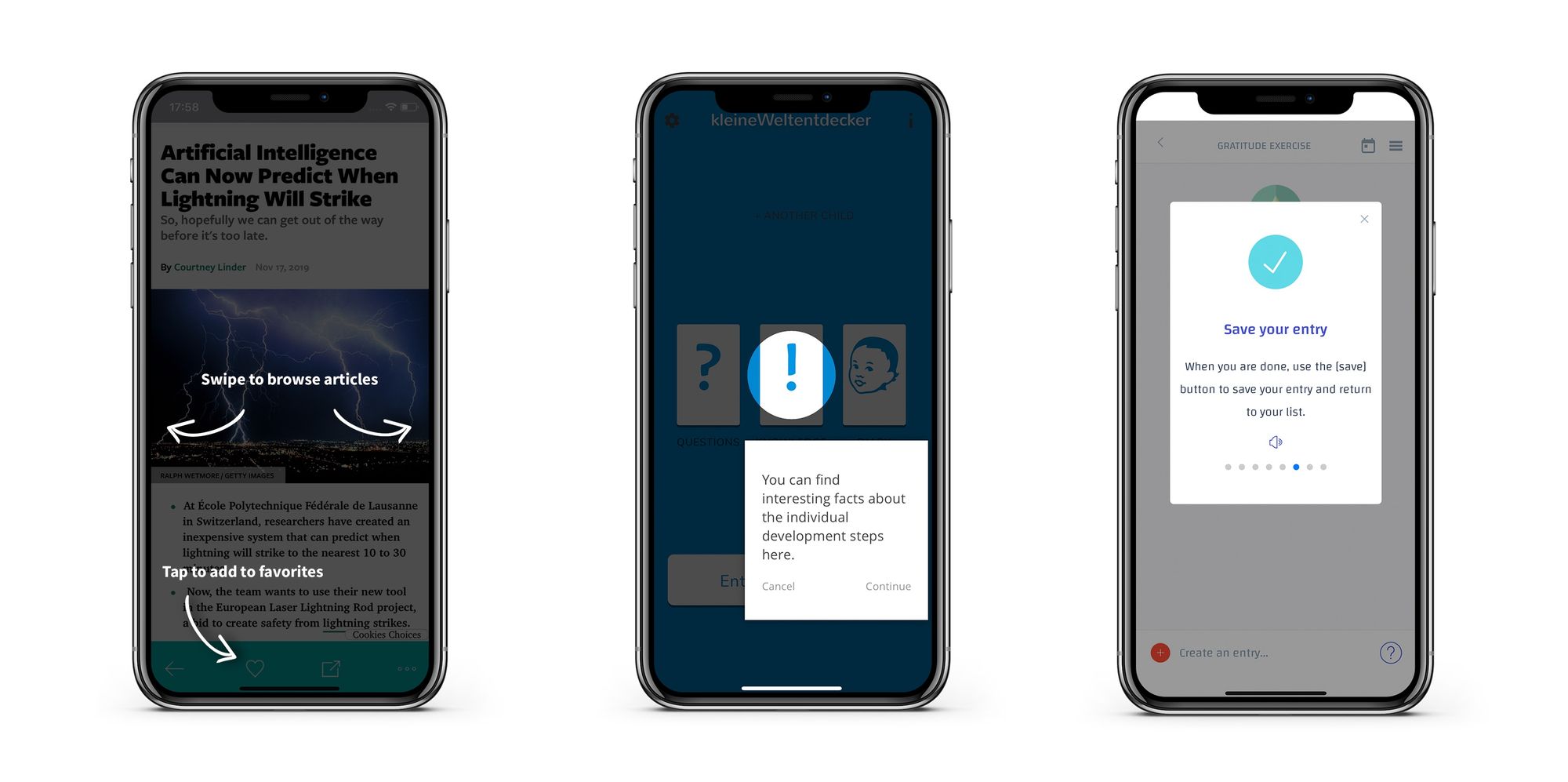
- Overlay image : Implement a simple full-screen overlay image that goes away on tap.
- Highlights : Go through the features step-by-step by highlighting them and drawing the attention of the user on a specific icon/gesture. Make sure to give them the option to leave the onboarding anytime.
- Dialog : A simple way to implement additional information is to add a dialog, that will appear when the user first opens the view. Bonus points if the user can later find this information again, for example with a help button.
Empower users
Avoid frustration! Progress indicators are highly recommended for longer onboarding flows, they make users feel in control.
If your app offers this possibility, lead the user to finish the onboarding with a clear CTA to make them feel accomplished: adding their first connection, creating their first entry, etc.
Once they have completed the onboarding and understood the flow for one of the features, a consistent UI will do the rest for you
My personal recommendations
- Keep the sign-up simple: if possible, try to integrate with existing authentication providers. The most common services are Google and Facebook.
- Define clear goals for your onboarding: why are you adding this extra layer on top of your app?
- Animations are always a good thing to have but don't overdo it and keep an eye on the overall performance of the app.
- Add analytics in the onboarding: uncover what your users are struggling with or identify their reasons to churn.
Deciding for an onboarding method is not an easy task. In general, it is good to select only a few features and rely on user testing to define how much information is needed for each step. From there, the design discussion can start. Good luck!