How to structure and name colour tokens in UI design?
This year Figma released a major update and introduced some new features such as local variables, their implementation of tokens which we have already discussed in detail in another blog article (The future of Design Tokens). We, the UX/UI design team at Hybrid Heroes, have been waiting for this update for some time and are delighted to finally be able to use it.
As we started to explore the possibilities that the local variables give, a lot of questions came up. One of these was again the naming convention and structuring, which we want to adapt in our design systems in the future.
We already had an approach to how we structure and name our design tokens, but with the new features we wanted to go deeper and establish guidelines that we can consistently follow across teams. In this article, I'll take you through our deliberations and what we came up with in the end.
What are local variables?
Local variables are a feature available in the right side bar in Figma. Variables can be applied to any layers and objects.
Variables allow us to create, store and use reusable values in Figma, such as text strings or colours, etc. They can then be applied to all layers and objects. For example, a number can be used to represent the corner radius value, or a colour can be referenced to always be used as the background colour of a button.
There are four different variable types available at the moment (we are already eagerly awaiting the next announced implementations of fonts and gradients):
- colour
- number
- string
- boolean

Division in collections
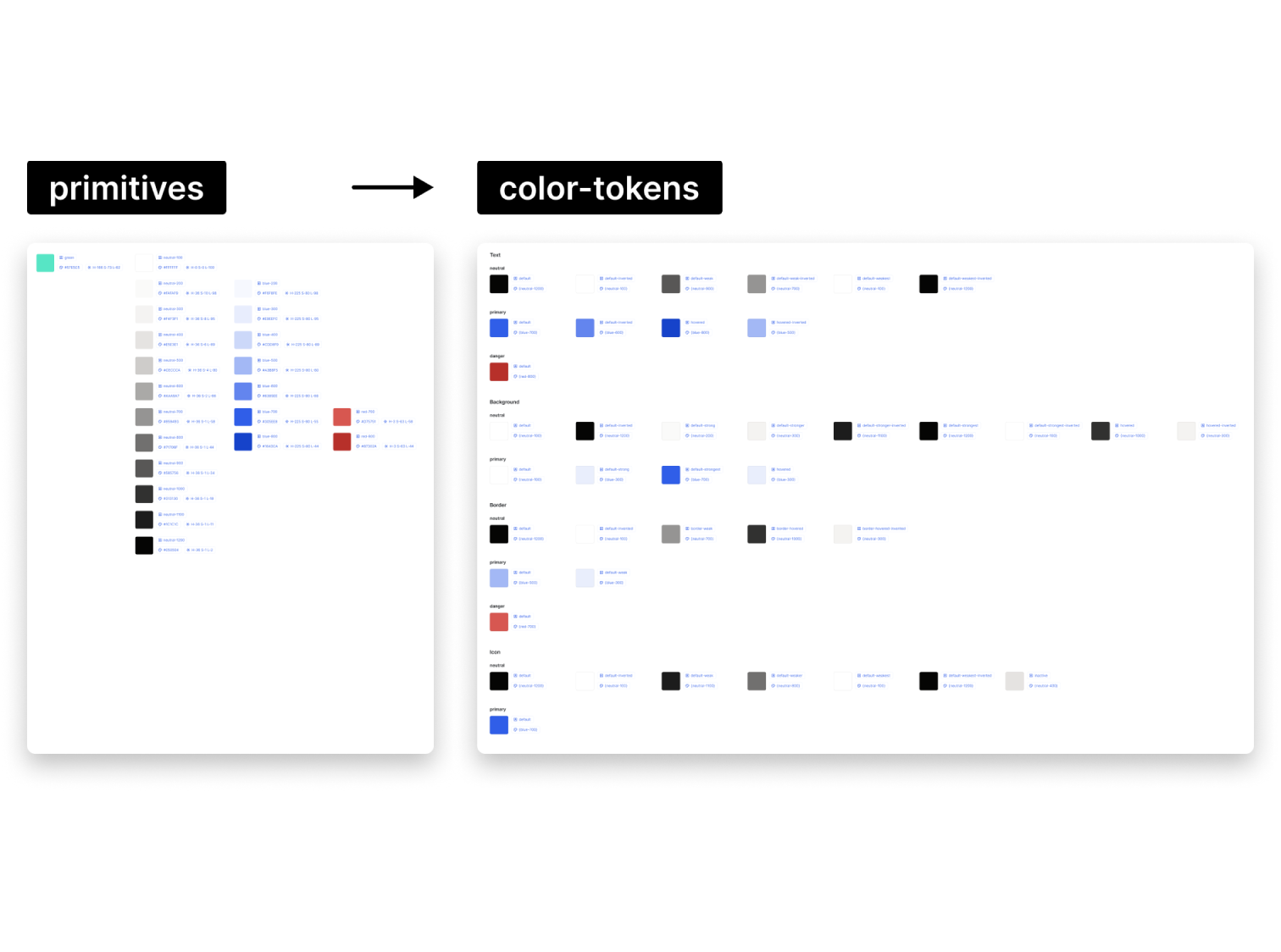
The local variables function not only offers the option of saving all tokens in different collections, but also of linking them with aliases. We decided to use two linked collections for the variables – colour primitives and colour tokens.
Now, why do we use this division between primitives and tokens?
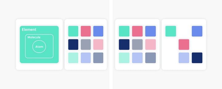
The primitives are our base library, which we can use for our tokens later. They describe the value, e.g. colour/blue/700, whereas the semantic tokens describe the purpose, e.g. background/default.
If, for example, an opacity is needed, it is created in the primitives and treated in the same way as the other colours. The name is composed of the number minus the percentage of the opacity, e.g. colour/blue/500-20 (opacity at 20%).
Naming convention
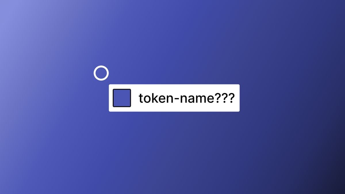
After some consultation, we decided to write the names of the variables, collections and modes in lowercase with a dash to keep it consistent and easy to understand, using so-called ‘kebab-case’ (I guess it looks a bit like kebab, doesn’t it?), eg. default-inverted, default-weak etc. This is also helpful for automatic export by plugins. The naming convention is standardised and developers can decide for themselves which naming convention they want to use and have it reformatted if necessary.
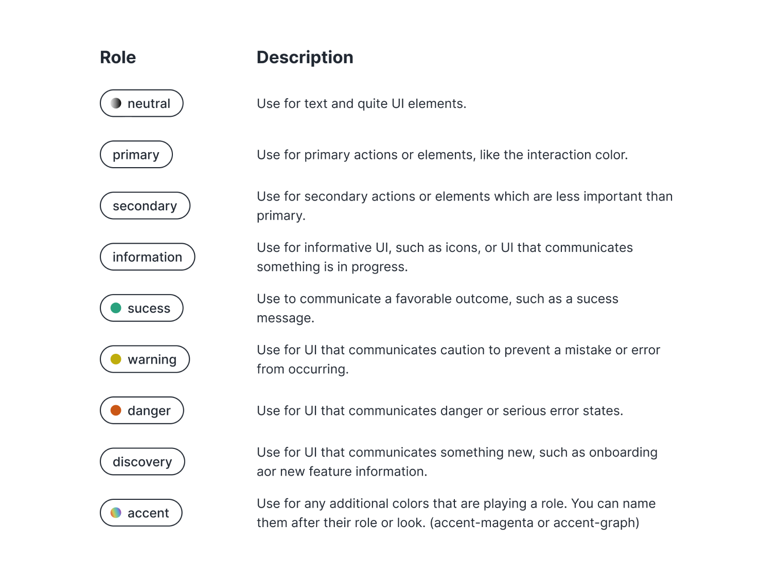
Naming of tokens
Another decision to make was around the naming of tokens themselves so that they clearly communicate their purpose. In our design system the name of the token results from putting together the category, property, modifier, interaction state and gradation.
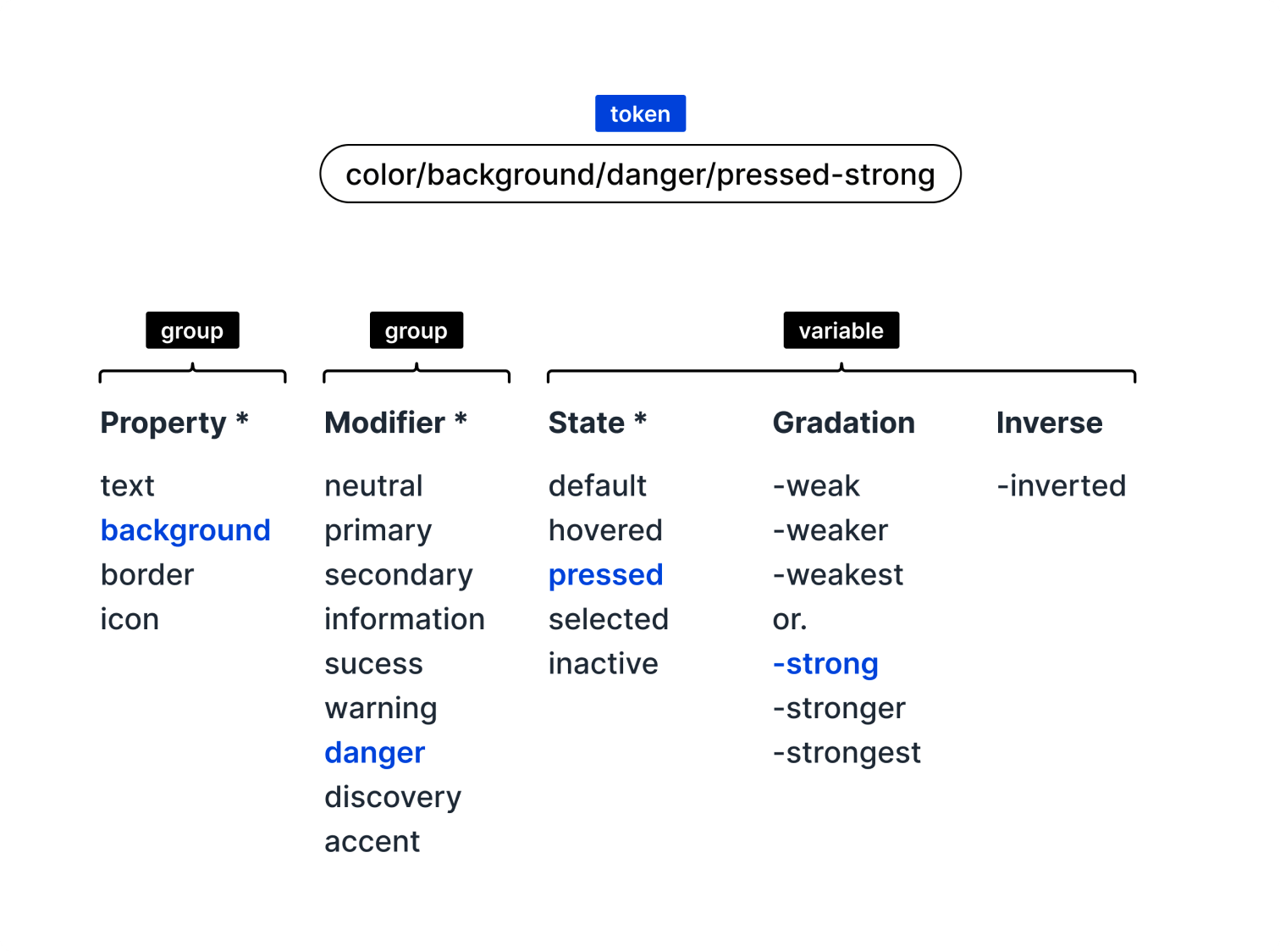
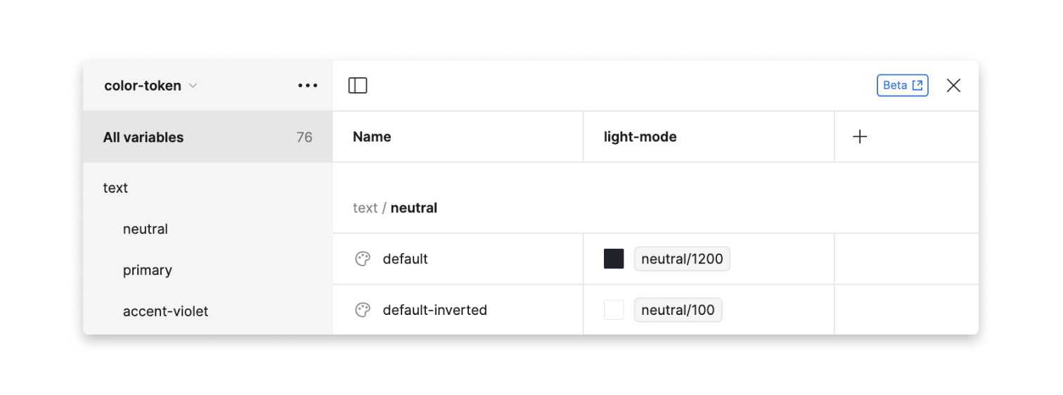
In the illustration above, parts of the name are labelled as a group. The reason why we do this is that they are then created as folders in the collection in order to have a structure that makes it easier to pick the tokens later on. The following screenshot shows how it was applied in Figma.
(color-background-danger-pressed-strong) – Is it a bit long? Yes. Does it make it easy to know exactly what the token is for? Also yes.
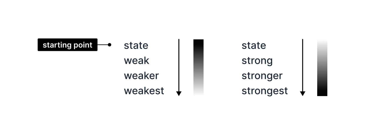
Gradation of tokens
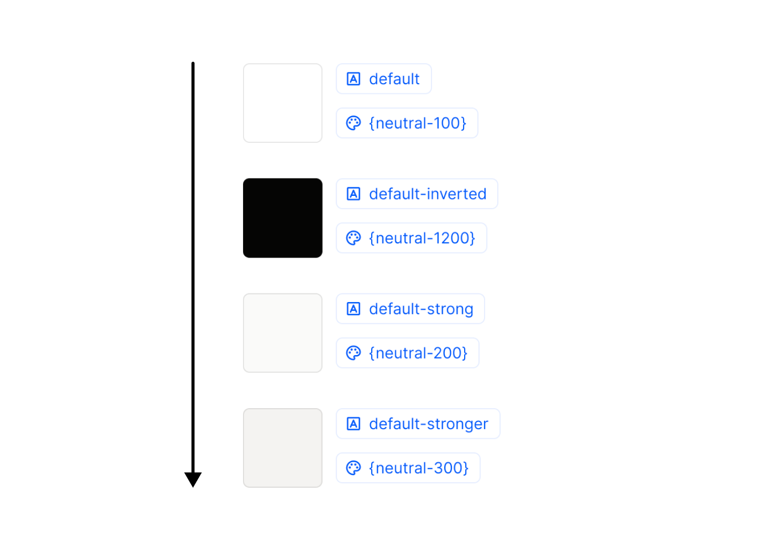
You may be asking yourself when a color is strong and when it is weak? Well, that depends on what your default colours are. If the default is light, the gradation becomes stronger, if it is dark it becomes weaker. To have the flexibility, as in the example below, to write a standard text on an inverted background, we have added the option to add the label inverted to the name. This gives us the possibility to add another four values to the text-default variable.
Modifier
Which modifiers you need depends on the project and the scope. You can select the most fitting options for your project from the list provided. Everything is optional.
Why does it matter?
The power of the tokens is noticeable especially when you work with different modes, like light and dark more, or different language versions. Before the local variables feature, you’d have to create separate tokens or change the colours manually for light- and dark mode. Now, with the local variables set up, you can simply define how the colours should change according to the mode and then simply hit the switch. What’s even more practical, in case of changes, you only have to change it once in the variables.
In conclusion
In product design, having one source of truth for tokens is paramount. We at Hybrid Heroes are so passionate about this that we are in the process of developing a Figma plugin that will allow easy export of variables for developers or documentation for designers to make sure everyone is on the same page. Stay tuned!
At Hybrid Heroes we always strive to make the concept, design and development process as seamless as possible. If you are looking for an efficient full service partner for your digital product, give us a call and tell us about your design and development needs.